Meet the team: himHallows
Manchester's finest, Paul Hallows talks us through the inspiration behind his interstellar illustration
Having long admired the work popping up around Manchester under the name ‘himHallows’, it wasn’t until intern moved studios to Islington Mill a year ago that I’d had the pleasure of meeting Paul, the man behind the name. It was his impeccably detailed and imaginative gig posters that first caught my eye, injecting a real finesse and wit to what can often be quite a routine medium. Soon though, his mark was being made on far grander canvases, as murals emerged around the Northern Quarter and 3-D work was added to the mix.
As soon as I started sharing a studio with Paul, I was struck both by his character and his meticulous approach to his craft. His passions and inspirations so often are articulated in his work, which in turn has birthed a style rich in both detail and personality. Having observed his masterful pen and ink work over the course of a few months, I was certain that I wanted him to be part of Issue Two. When we were working on Zara‘s interview with Adrian Shaughnessy, Paul struck me as the ideal man to work on a portrait of our esteemed subject. Sure enough, the illustration he created worked perfectly, setting the tone for the insightful, intriguing piece that followed.
This week’s Meet the team is a bit of an indulgence on my part. Personally, the series is always a great vehicle for finding out what makes people tick, asking questions of a friend that I’ve never asked before is a bonus. Paul is a fine illustrator and has very much forged his own path, defying convention along the way and following his gut instincts. In an era when the realities of freelance work strike more of us than ever, his is a refreshing and inspiring tale of going your own way.
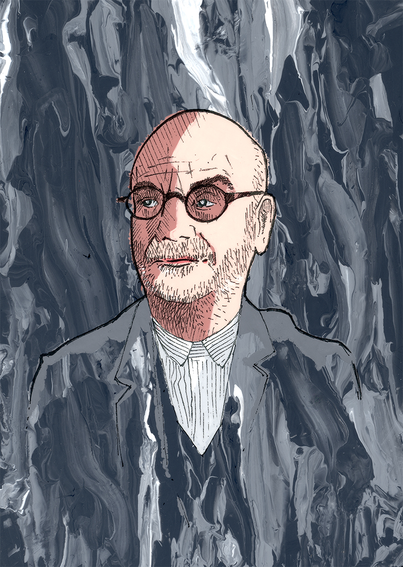
Adrian Shaughnessy for Intern Issue Two
I first saw your work years back when you were designing a lot of great gig posters for Manchester promoters WOTGODFORGOT and Up The Racket, my favourite being the Joe Gideon and The Shark one. What attracted you to that as a creative medium?
It started with doing a couple of flyers for Ciaran (WOTGODFORGOT) ‘s old band Laymar waaaay back when we were in college but not really thinking anything major of it. With hanging round town more, I discovered David Bailey and Savwo‘s work and thought ‘Wow, poster’s can be so ALIVE and full of magic!’. Got to doing the WGF posters and feeling like they could be a very public platform to push my artwork and ideas out there. To use posters as a way of not just for advertising, but also put art into peoples heads as they walk past. This poster work is where the acetate painting comes from too. I had to produce a colour poster as a band commission but couldn’t afford a computer and software to do so at the time. I could however, afford acetate and I had a lot of paint lying around. This necessity became a pleasure, colouring the old fashioned Disney way.
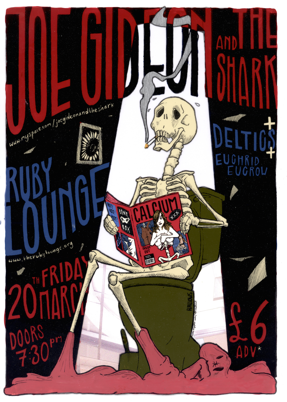
Joe Gideon and the Shark gig poster
How did you find your way into illustration? You studied Physics with Space Technology for a while, before switching to an Art Foundation course. How did the two worlds compare?
You know how children grow out of wanting to be an astronaut at around 11? Not me. Wearing glasses stopped me taking the pilot route, so went into the sciences instead (where wearing glasses is a lot more encouraged). I was an appalling student with zero aptitude for maths, and barely scraped onto the university course I needed, but I’d been drawing all my life up to that point (I was doing a lot of work for enjoyment outside of my course) and it was creeping into my lectures. I think I got to the realisation that I actually hated the course I was on (and even if I did pass, I’d be the last person on a long list of qualified people to send into space). I’d always wanted to do art too though. So I spent a few years building up a portfolio, doing more commissions and getting the finances in a regular job to do my art foundation. Which I promptly dropped out of after a few weeks in… Mainly due to good money coming in for illustration. I couldn’t do a course, my commissions and work an evening job all at once mind. I asked advice from a lecturer and he told me to go for the commission work as it’s what I’d been aiming for and that the degree was a ‘three year indulgence’ anyhow. Turns out all this time I’d put into doing work to getting onto a course to become an artist, I’d kind of become one.
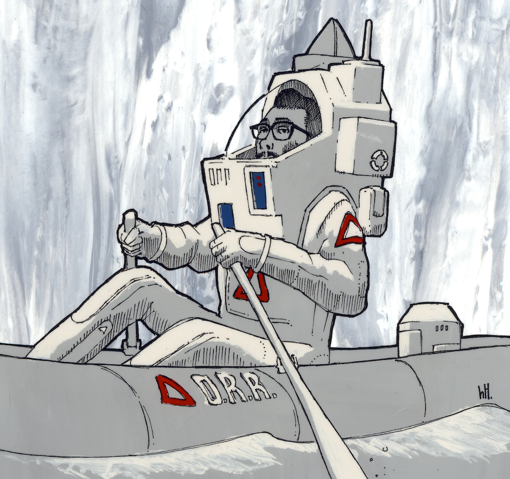
himHallows in space
Space and Sci-fi are recurring themes in your personal work, how has your art functioned as a means of staying connected with those interests?
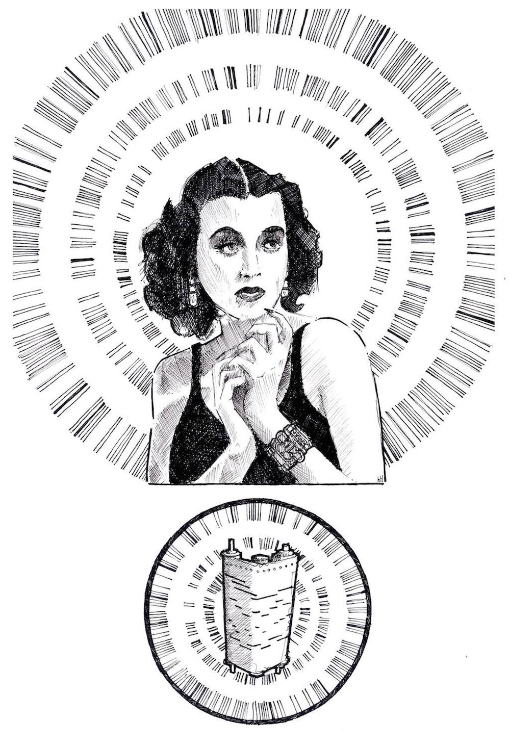
I’m a huge science-fiction fan and for good reason, it’s a great medium for not only building a great story but also for delivering a message in an unconventional way. So I like to use science fiction the way it’s intended, as a mirror and a way to explore ideas with visual impact too. Space is a big feature of this message. It’s the idea of something so unknown and with so much potential too. Beyond this planet is terrifying and beautiful all at once, it’s a void we look into to see ourselves.The question is, not what we find out there, but what we find out about our own species as we start to crawl out into that frontier.
It’s intriguing that your illustration style has a realist slant, particularly when you’re illustrating people (Adrian Shaughnessy for Intern or Alan Turing for Manchester University). What were your influences when developing your look?
My Dad gave me a Fabulous Furry Freak Brothers comic when I was a child not fully realising what the subject matter was (mostly law breaking and psychedelic hippy lifestyles. Mostly). I think going from the Beano to that and just seeing not only how great the actual story telling was, the artwork that went with it was so rich and full of depth, what line work! This kind of style was at odds with my other passion of science fiction though, where I’ve wanted to do a coldly realistic image of the ideas I have. Also, drawing correct proportions makes me happy. What I do now I think is truce between the two and I’ve noticed as I get older, my work tends to look more serious and I feel more confident about what I’m putting to paper.
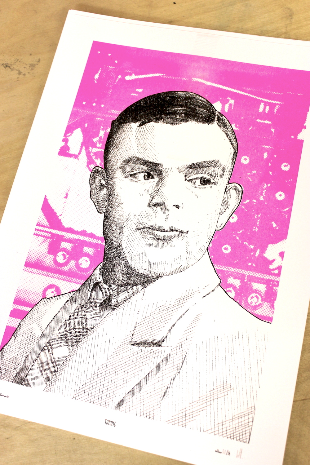
Alan Turing for Manchester University
You take great delight as well in the materials and techniques that you use, often working with acetate and acrylic. In an era when digital techniques are becoming more and more popular in illustration, can you see yourself moving away from some of those more traditional processes?
Yes, kicking and screaming in some cases, wilfully in others. I’ve started using Photoshop recently to add layers together in my black and white work and in some case add colour, but I doubt I’ll ever stop using pen and ink as my actual way of drawing. Plus, working in layers is good for risographing. As for the acetate (which I paint the reverse of cell animation style), ten years ago most print shops in Manchester printed to acetate. Some did great prints, some did shitty prints. As of writing, there’s now only one place I know. When this stops I don’t know what I’ll do. Not a major boner as my layer style is where I’m working more anyhow, but I’ll be sad to leave the acetate behind.
One of your latest projects, Grand Tour has been realised both as a publication and an exhibition (at Kosmonaut in Manchester). How does working on the two elements compare? (Do you prefer some features of one to the other, materials used etc)
Hard to say, at first I thought the Grand Tour book would be the stronger of the two, it’s illustration and the original idea and all I saw when I thought about Grand Tour. My spray paint work has a very different look, a lot more colourful, less defined and more of an experiment for me. Didn’t know if it would translate well. What turned this around was buying a can of shadow (a darkening agent). As a result, for how different they were, I think they stood up well to each other. The book is compact and feels more like a design piece, whereas the murals look like the kind of pictures you see in bars or quarters in 80’s sci-fi films.
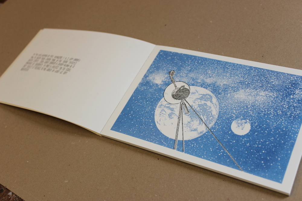
The Grand Tour publication
You also have an ongoing collaboration with Textbook Studio for Video Jam, what makes it so enjoyable to work on?
Textbook Studio are not only only great designers, they’re good mates too. It’s easy to discuss ideas frankly with them and work out what direction the work should go in. I was especially happy with how the Ryan Gander response Imagineering Doodles turned out, which involved a fair amount of filming and editing too. It’s always good to try a hand at something different, keeps the collaborations (and your own work) feeling fresh. Video Jam put a lot of faith into our ideas and it’s good to feel that appreciated. VJ do fantastic events at some amazing locations in the country, being a part of that is an honour and that feeling pushes me and Textbook to make something special for their events. In fact, the style I started initially using for Video Jam is the one I use in most of my work now, so that push has had a very positive impact on my work.
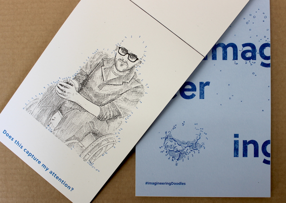
Imagineering Doodles for Video Jam
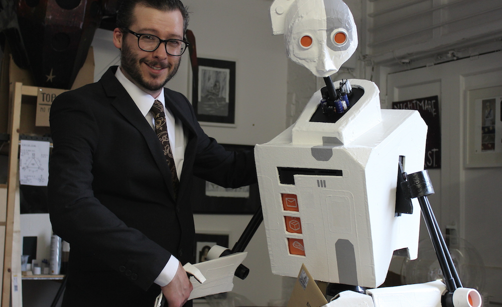
Studio 211 often births new, three dimensional residents, crafted rather expertly from cardboard. What first got you in to working in 3d and how do these projects fit in as an extension of your craft?
I’ve always had ideas for 3D pieces but never really seen where to start with them. It really kicked off when I started renting a studio and had space to try out ideas. Cardboard has been pretty abundant (especially as in my part-time job I can acquire a lot of really good STRONG stuff) and I could get enough to start making the ideas in my illustration’s come to life. It’s important to try out new creative avenues, you never know where an idea might lead to, maybe a new passion for the arts.
I especially like to do this with the 3D exhibitions me and Ciaran (WGF) put on. It’s that opportunity for myself and the artists I like to do something unexpected outside our craft, even if it serves no purpose other than just having fun or test out new methods. I did get into laser cutting through the show. The posters for both F L I G H T and L A N T E R N featured laser cut and folded planes and lanterns in the design. I think that’s something I’d like to develop in the future.
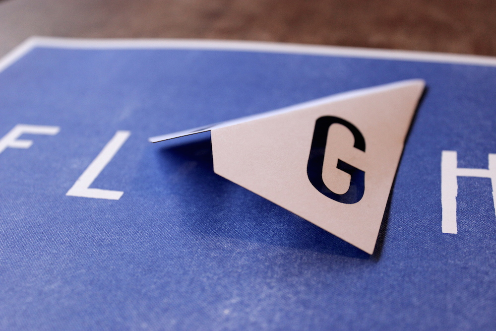
F L I G H T exhibition poster
What are you working on at the moment?
The most imminent project is Dark Mass, a tiramisu stout I’m collaborating on and artworking with Quantum Brewery and James Moffat (Art&CraftBeer). One of my great pleasures of life is drinking a pint of beer with tiramisu on the side (as you can imagine, I have to limit this pleasure to about twice a year…). The fellas at Quantum let me and James come down on the brewing day and see the whole process in action. I’m very excited about trying this once it’s brewed and currently making sure the labels are all ready for the big bottling day. I like where illustration takes me!
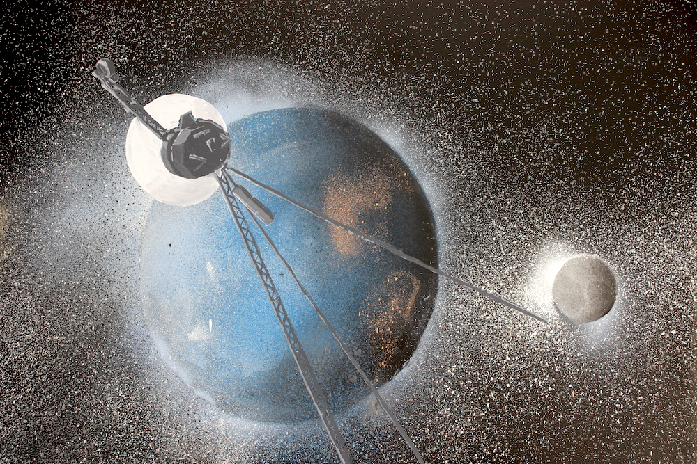
Grand Tour at Kosmonaut
If you could pass on one piece of advice to aspiring illustrators and artists, what would it be?
Experiment! Experiment! Experiment! I’m guessing anyone who goes into a creative field does so because they love doing the work, so don’t let it get stale for yourself, don’t let it become JUST A JOB. Always say yes to trying something new, go out to the smaller exhibition launches and get to know the work and artists, we’re all usually friendly enough. And don’t forget to allow yourself a lot of play time when you experiment, it’s important to be able to just DO something and dick about, it’s where great ideas and techniques come from.
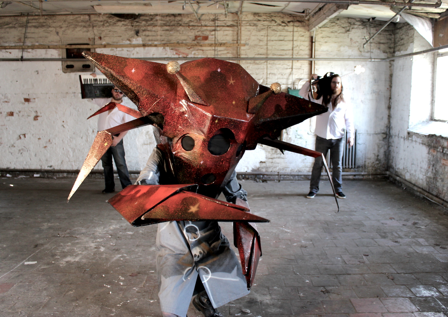
The Meta Crab, on of Paul’s 3D creations
_______
Head on over to Paul’s site to check out more of his work and to book his services


