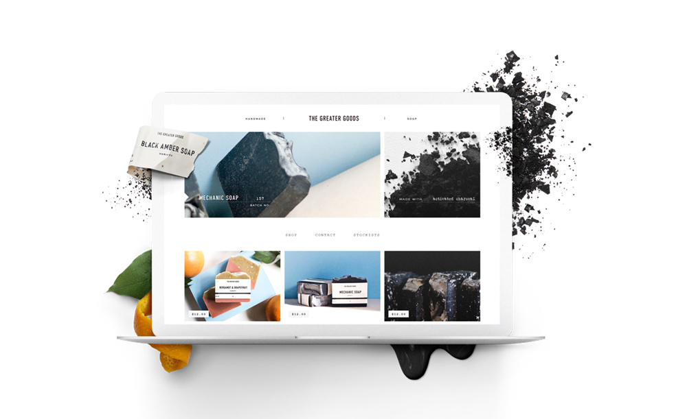
Build it beautiful with Squarespace
With a 14 day trial period and a pair of brilliant offers, Squarespace is a great option for a beautiful, easy to manage portfolio site
As we prepare each issue of intern, our pledge to be foremost for and by the creative youth is a constant guiding light. However, we cannot hope to achieve this without the support of sponsors, each of whom make what we do possible.
Crucially, we’re always keen to work with organisations that understand what we’re about, and we always strive understand their work too. Squarespace, one of our Issue Three sponsors, are one such organisation: they just get it.
Without requiring anyone to know a single line of code, Squarespace provides an exceptional platform for young and ambitious creatives to define their online presence. Offering 24/7 support, Squarespace will guide you through what can often be an arduous process, helped by a vast array of slick, professional and engaging website templates. Hosting is included too, so there’s no time wasted setting up databases and paying multiple bills.
With a mission statement that prioritises empowering people – “our purpose is to uplift and support”, and a wealth of tools on offer including e-commerce, social network integration and live statistics, Squarespace continues to be an excellent solution for young creatives. Their customer-centric approach is extremely evident in their latest campaign. Empowering users is what platforms like this should be about and Squarespace take great pleasure in fulfilling that role.
This, most definitely, is important. It can be difficult enough when trying to advance your career early on, but we can’t exaggerate the importance of a strong, engaging online presence, especially given its increasingly dominant role in communicating a portfolio of work. At intern, we so often come across websites of young creatives that fail to do justice to the talent they’re supposed to convey; in contrast, this is a problem which feels a million miles away when interacting with at a Squarespace site.
Of all their ideals, ‘simplify’ is perhaps the most significant. When showcasing your work, it’s all too easy to over-design. It may sound painfully obvious, but it really is worth repeating that the work itself needs to be the star of any creative’s site. Clear, easily navigable sites with attention to detail in the right places are what Squarespace excel at. From the outside looking in, their sites radiate professionalism and behind the scenes, the same effort goes in to your experience.

As content management systems go, Squarespace’s is right up there when it comes to intelligent and natural user experience design. Designing your own site often sees this side of things suffer as the visuals are tuned, but the beauty here is that the simplicity of the CMS ensures that no time is wasted on anything other than your latest and perhaps, greatest work.
As ever though, the best thing to do is to check it out yourself. Ultimately, you’ll get a damn fine website that’ll help no end in supporting your career. And the clincher? Use the code INTERN at the checkout and receive 10% off your order following a 14-day free trial. It’s also worth checking out their student offer, with 50% discount for the first year if your university is part of the Squarespace education programme.

