Meet the team: She Was Only
In conversation with the London-based design studio who've shaped the visual identity of Intern from day one
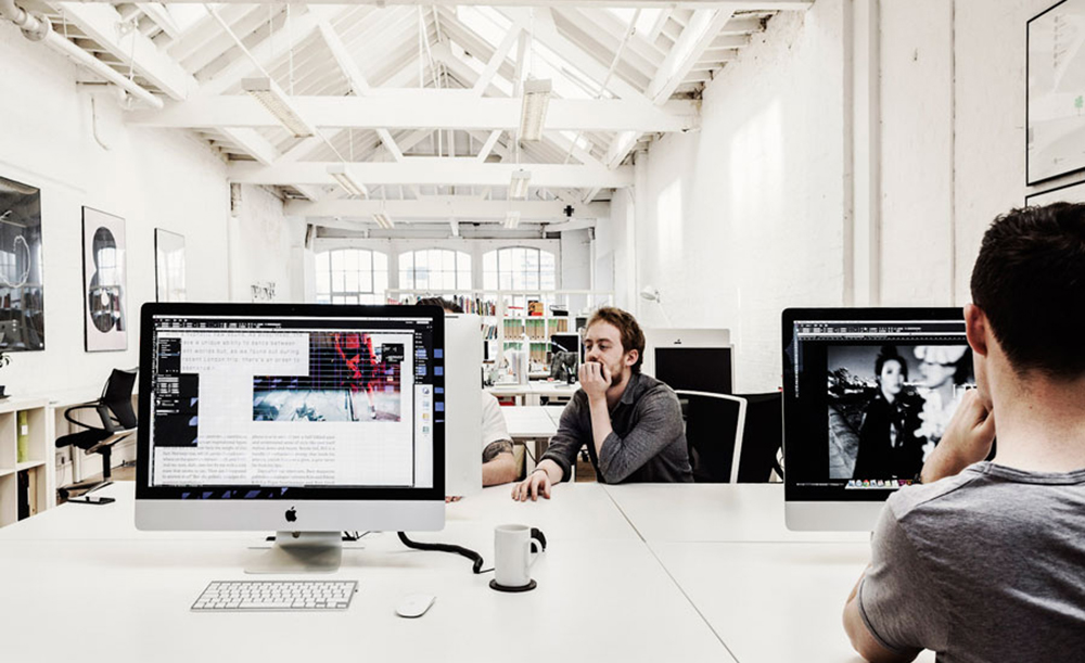
Studio Photographs by Max & Liz Haarala Hamilton
This week’s Meet the team is a bit of a special one. Back in November of 2012, when the Athens issue of Boat had come out and my seven month internship there was winding down, I had started to ponder my next move. I’d grown very fond of the entire team and had loved working with them on what had been a great adventure. Having toyed with the rough concept of Intern for a week or so, I pitched it to Davey (Spens) initially in the “meeting” area of Hoxton Crypt. After an hour-long chat, I remember feeling that although the idea needed refining, that it could be an idea worth pursuing.
With my background being as far from design as you can perhaps imagine (Sociology), it seemed only natural that one of the first steps I needed to take, was getting some top quality art direction on board. Chris Vickers had been working as Boat‘s freelance designer during my entire time at the mag and as soon as I had finished the meeting with Davey, I put the idea to him and asked if his then fledgling studio She Was Only would be interested in taking it on.
Fortunately, when Chris floated the idea with Craig Scott and Cai Griffith, they decided to come on board. Having first designed the masthead, the next task was putting together Issue Zero and our Kickstarter campaign. The press coverage we got during that month-long stretch consistently lauded the design of the newsprint showcase and as we hurtled towards our target, I couldn’t wait to piece together Issue One with the guys.
While the magazine makes a point of featuring contributors who, technically speaking, are still amateurs or part-time freelancers at the most, I felt that art direction and design needed to be handled professionally. Having seen Chris work and having met Craig a number of times when he was brought in to work on various projects with Boat, I had felt that the friendship and shared vision that we had developed would go a long way, particularly in giving me the confidence to step back and let them do what they do best, make things look great.
It’s been a joy working with them so far and also seeing the studio grow. What was three initially, is now four, with Jonny, whose developing skills you are treated to on this very site, further enabling them to take on an eclectic mix of projects. With Issue Two very nearly sold out online it seemed the perfect time to pay homage to and introduce in more depth, the longest-serving members of the Intern Magazine team, She Was Only.
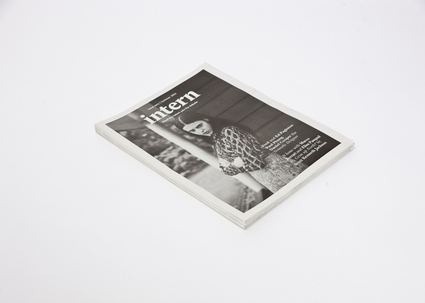
Where it all began,
Issue Zero of Intern
You guys were, along with Davey, the first people I pitched the concept of Intern to back at the end of 2012. What about the project appealed to you then?
We were all interns once and know how frustrating the creative industry can be in terms of finding work and getting noticed. Internships and the post-uni limbo is almost a subculture in itself now and it isn’t a widely documented subject in terms of other peoples experiences and breaking into the creative industries. We felt that there was a constant audience of young people who could really relate to the content.
Having art directed Intern from day one, have you been happy with how it has been received?
Incredibly happy. The reception has been fantastic and it’s great that the magazine seems to have found it’s audience who really relate to what we have created. It’s been a long journey but we’re proud that what began as a promotion 12-page newspaper and kickstarter campaign is now a 144 page publication that sells all around the world.
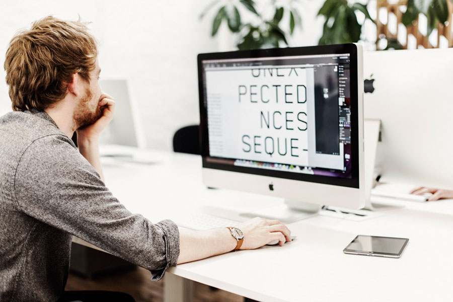
Craig at the SWO
studio on Curtain Road
For those who aren’t familiar with your work outside of Intern, how would you describe your aesthetic/philosophy?
We wouldn’t say that there is a She Was Only aesthetic, but more of a consistent approach to how we handle our projects. To quote our own website “Our work is built around the principles of simplicity, clarity and elegant problem-solving. We filter out distraction to add focus, creating beautiful work that commands attention.” What we mean by this is that we always put a lot of time in at the start of a project to get to the core of what the client is trying to say, then aim to deliver work which conveys this message in a clean and uncluttered way. No distractions.
Individually and collectively, how much do you enjoy editorial jobs in comparison to other work?
Although we value every project we work on, we all have an attachment to editorial work and in particular our work with magazines. The studio is very fortunate to have a history of working with a number of different titles all of which generate amazing content for us to work with. By always respecting the content we receive and having a good working relationship with editorial teams, we’re given increasing levels of freedom which allows us to really enjoy the project. Plus, you can’t beat the feeling of getting something back from the printers a week later, and seeing how it all came together.
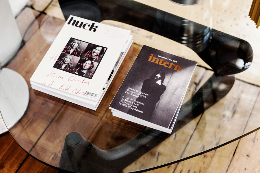
Huck 42 & Intern
Issue One designed
by SWO
As graphic designers, how do you see print in today’s creative landscape? Is it on the way out or is it here to stay?
There’s certainly been a shift, but I don’t think it’s on its way out. Digital media is so temporary and immediate, print has taken on a new role that’s much more about the object. As designers, when creating something in print it’s more important than ever to make it not only look good but feel good too.
Obviously designers have a stronger attachment to print than most, but it’s always an exciting day when the studio receives something back from the printers, regardless of the project. I think that’s the power of print. It’s tactile and real. Look at independent publishing; it’s flourishing at the moment. In an age when it would have been easier to start a blog or website, more and more people are choosing to produce physical magazines and there is a massive market there. I guess it’s up to the people behind the magazine, to try and push the boundaries of what’s possible with print and make the publications themselves something worth hanging on to
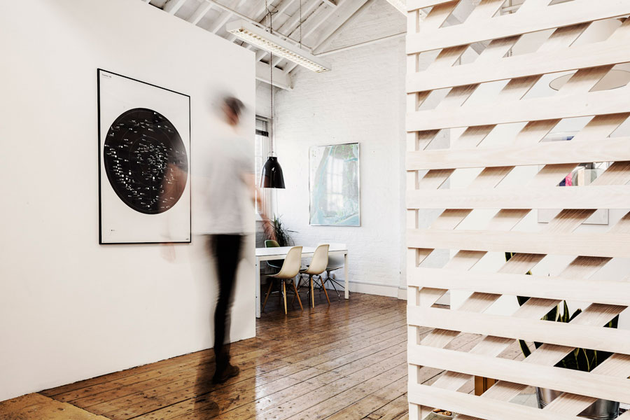
Chris at the SWO
studio on Curtain Road
What’s the dynamic when you work together? Does everyone have a different role?
Our team is intentionally small and we make no secret of it. More often than not we’re each involved in every project going through the studio. We’re essentially a team of four, made up of three designers and a developer. By staying small, playing to our strengths and collaborating with our network of freelancers such as photographers and copywriters we add value in any way we can.
What else have you been working on recently that you can tell us about?
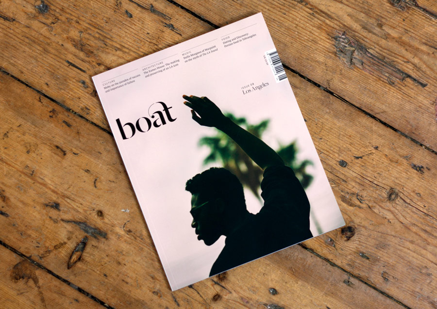
Our work varies, but terms of other publishing jobs we have recently finished designing issue 08 of Boat Magazine, and are really excited to be working on a new book with Laurence King, which is due out late next year.
We’re also busy putting the finishing touches to a new website for an Art Gallery in Mayfair, launching a new furniture brand and re-branding a long standing, high-end construction company based in London.
What does the future hold for She Was Only?
In the immediate future, we’ve just had some interesting job enquiries which we are excited to start work on. In the long-term we just want to carry on producing interesting work for good people.
Of course issue three of Intern isn’t too far away either, so it won’t be long until we turn our attention to that!
