Launch Press
We were charmed at the Manchester School of Art graduation show by this project's wonderfully artistic applications of design thinking
Mid-June is always a time of great excitement for us at intern. Around the country, creative students are putting the final touches to their work and setting up their graduate exhibitions. This past year we’ve featured some brilliant final year students’ work and seen inventive and wonderfully executed graduate show branding and identity.
To add to that, we had the excitement of seeing Issue Two’s Phoebe Kiely graduate in the Manchester School of Art photography show. It was an event where Issue Three contributor Sophie Lee, presented the alumni award to Gideon Vass.
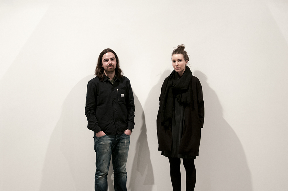
Having spent the afternoon and evening roaming the Manchester School of Art show, a handful of projects stood out and the one closest to my heart has been on my radar for a couple of months. It will come as little surprise to regular readers to hear that I’ve picked a publishing project. Having first met Dominique Fletcher and Michael Curia last year when lecturing and sitting on a panel for the Unit X part of their course, it’s been a delight to watch this all come together.
The Black Line
Launch Press is the pair’s novel twist on artist book publishing. In the spirit of this year’s show, their first two publications are collaborations with graduating photography students Joe Briggs-Price and the aforementioned Gideon Vass. While both photographers produced their own books as part of their final projects, Dominique and Michael have created something quite brilliant in each case. When discussing Launch Press’ re-imagining of his project The Pale Wall, Gideon told me “It’s not a direction I would have ever gone in, but it’s amazing to see what they’ve done with it”.
For a while, I couldn’t quite work out how Launch Press would fit into the market. Artist books are usually very limited runs, hand-made (often by the artist themselves) and are quite a niche product. Having seen The Black Line and The Pale Wall in the flesh, I’m left in little doubt of the project’s ability to establish itself as a cult and essential entity. While very different, the likes of Self Publish, Be Happy and Hoxton Mini Press are a good benchmark for the potential popularity that Launch Press has.
The Pale Wall
Having rattled on now for long enough without actually discussing what makes this project so outstanding, I shall get to the point. The first thing that strikes you with both The Black Line and The Pale Wall is the look and feel of them. They are deliberately physical, urging you to touch, interact and consider them. While a gross simplification in both cases, in order to contextualise the attention to detail in this project, I need first to quickly outline Joe and Gideon’s pieces of work.
Joe’s Why Do We Fall? project, the basis for The Black Line, “explores the qualities of the role model”. Swimmers are the elite athletes that focusses on with a series of striking portraits supplemented by beautifully composed detail shots of the swimming pool – the place where all the hard work is put in.
The Black Line’s namesake adorns the inside cover
Gideon’s double award-winning Pale Wall saw him document a single stretch of wall over the course of three months. Throughout the course of the project he became interested not only in the space but the figures that interacted with it.
What struck me immediately about Launch Press is the process that precedes the finished product. In the video accompanying The Pale Wall, you get an insight into the manner in which Dominique and Michael value getting out in the field. Conversations with both photographers revealed that the note-making is lengthy and the pair’s attention to detail can often highlight elements within a project previously unrealised.
There are too many brilliant touches to each book, but I’ll run through a few in the hope of conveying the project as well as I can.
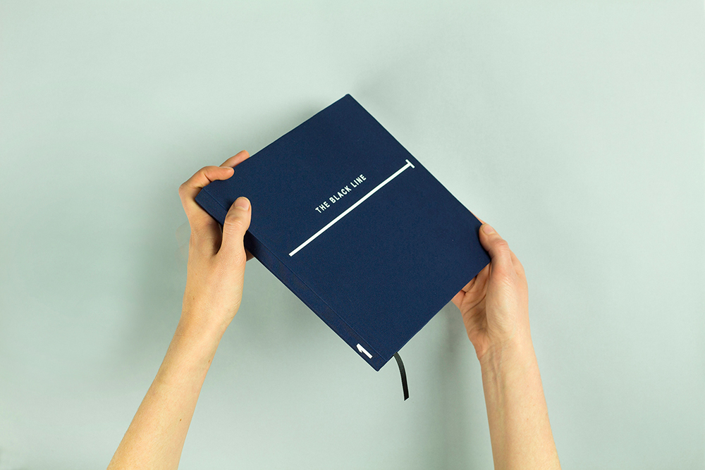
Launch Press’ eye for detail in The Black Line is immediate. The cover is made of dark blue lycra, synonymous with swimwear and the dimensions (even its depth!) echo those of the Manchester Aquatics centre with centimetres replacing metres.
Two of the portraits have been covered in hydrochromic ink, appearing blank until light application of water reveals the photographs underneath. This then dries white again, so that the viewer can repeat the effect. “Its significance is in the repetitive nature”, Michael tells me, “it mimics the repetition of the swimmers’ rigorous training regimes”.
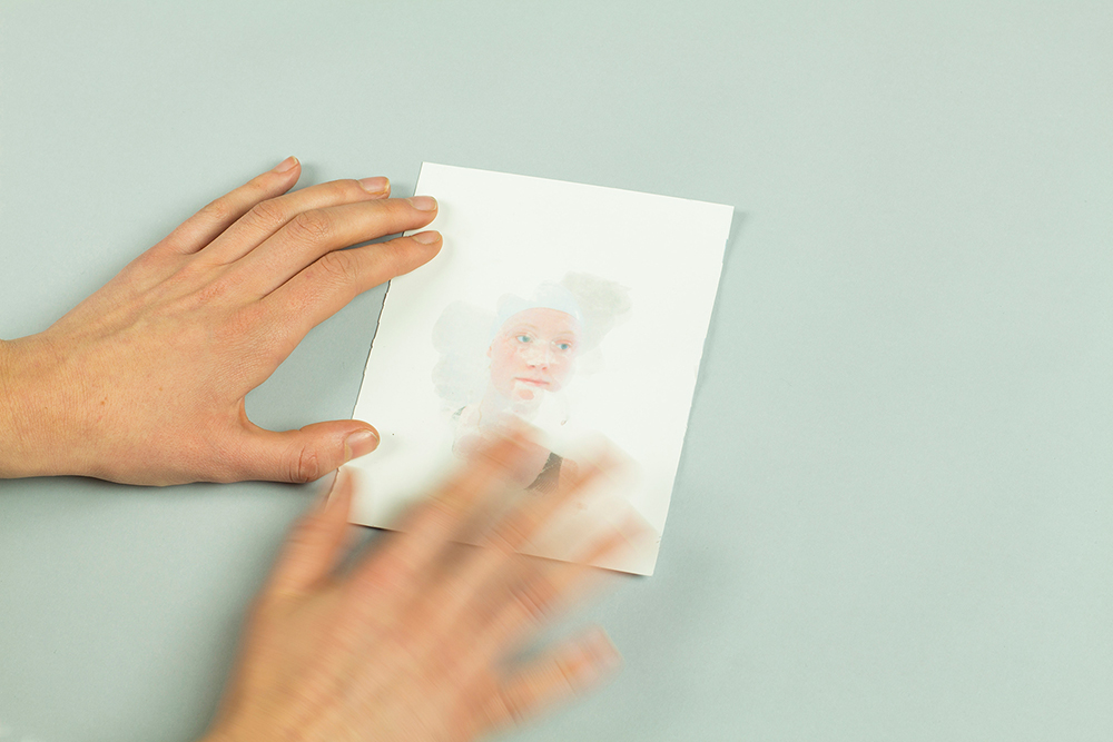
Portraits are revealed as water is applied to the hydrochromic ink overlay
Towards the end of the book, two other portraits have been soaked in chlorine for the same amount of time each athlete has trained over one week. This idea came from Joe, but he didn’t feel that it fit in his final exhibition piece, for Dominique and Michael, it was another intriguing layer of detail.
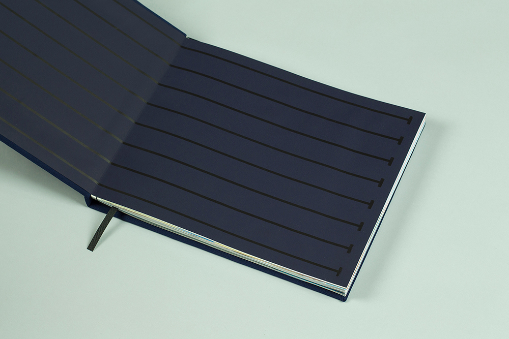
Interspersed with quotes from the swimmers when interviewed by Dominique and Michael, the entire publication has been set within the grid of the swimming pool. The Black Line is physically represented by a black bookmark ribbon and on the inside cover. It’s the line that provides a constant point of reference to the swimmers and so it does here too.
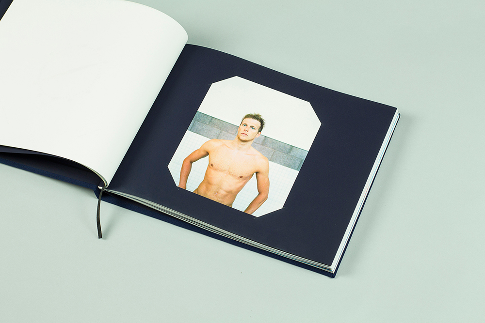
The portraits that don’t have a special twist to them are beautifully presented nevertheless
There are photographs within Joe’s series depicting the ‘forgotten spaces’ of the pool. These have been covered with tracing paper, with laser cut previews, inviting the reader to reveal and experience the images. In order to pace the book, design elements from the pool, noted during the research process have been screen printed ensuring that the swimmers’ familiarity with a handful of symbols is also communicated expertly.
At this point, would you be at all surprised if I said it was an edition of eight (one for each lane of the pool)? No, me neither.
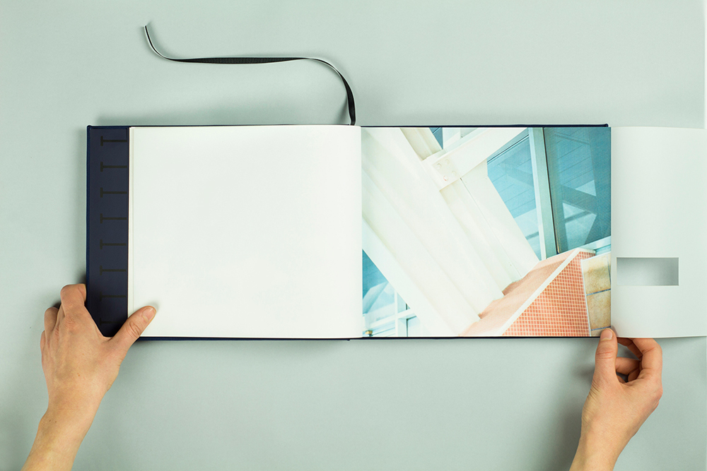
A ‘forgotten space’ is revealed in The Black Line
______
The response to Gideon’s work however, is totally different in outcome, matched only by the rigorous approach undertaken by the pair. Again the scale of the book was considered, a balance eventually struck between the wall itself and Gideon’s photography.
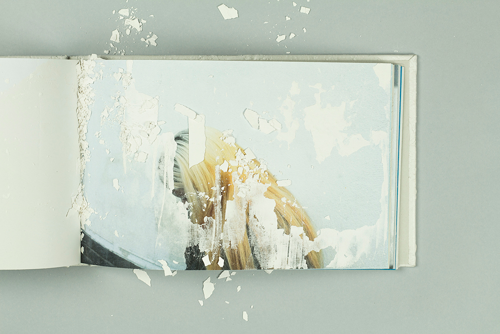
Reading The Pale Wall becomes a unique experience, with more of the photographs revealed each time.
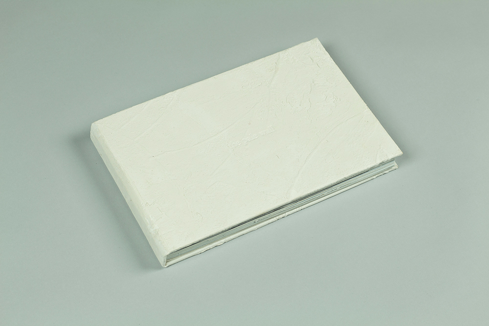
A mixture of wallpaper and Polyfilla has been used to re-create the wall for the book cover. Polyfilla has also been utilised throughout the book as it near matches the colour and texture of its subject.
Each of Gideon’s portraits have been covered in plaster to communicate the figures becoming ‘lost within the wall’. A good deal of experimentation was required to find a consistency allowing the plaster to stay on the paper, yet break away naturally over time. This natural decomposition intends to mimic the wall, as Dominique and Michael found that pieces were breaking off each time they visited the space.
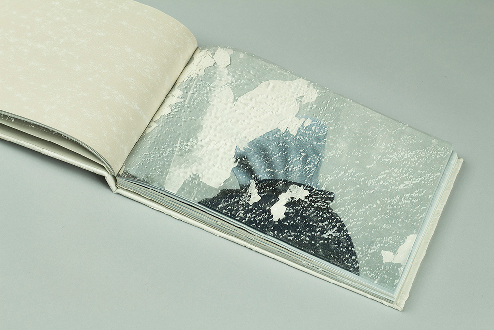
The Polyfilla mix obscuring the images is a nod to Gideon’s observation that people become ‘lost within the wall’
G .F. Smith donated the paper stock for the project, allowing Launch Press to execute their idea of individually studying each photograph within Gideon’s journey, and match it to a specific colour of paper. Gideon had found that the colours within his photography at the wall were subtly changing over time and as such the subtle changes in the colours of the pages encapsulate this idea.
None of the pages are blank, although some are tremendously subtle. Each one contains an experiment conducted from the wall, amongst them pencil, roller and chalk rubbings. It was important for Dominique and Michael to approach the book in the same manner as the photographer, by physically making work at the documented space.
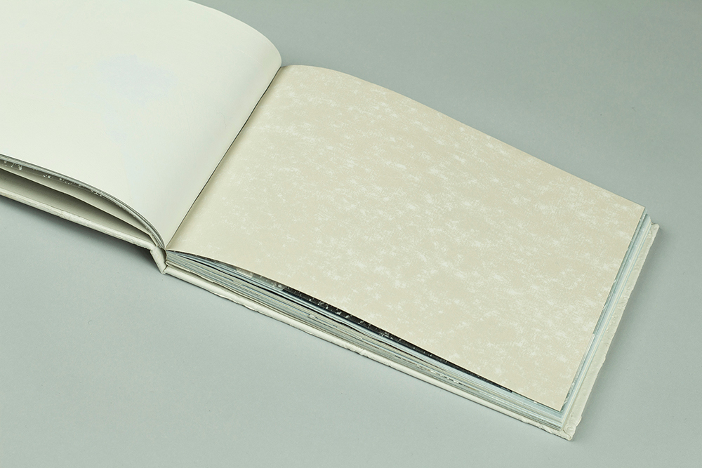
A painstaking documentation and replication of textures and tones intersperses Gideon’s photography
______
Having been totally blown away by these first two publications, I for one can’t wait to see where the pair take Launch Press in the future. Will they continue to work with photographers or will collaborations with other kinds of artists spawn a new range of striking and original readings and representations?
One thing’s for sure, those who think print is on its knees should take heed of this duo. The physicality and diligence of Launch Press’ projects demand the same consideration that they were created with.
______
For more, be sure to follow the project on Twitter and Instagram.


