Brian Cho
No detail spared in the Art Center College of Design graphic design student's comprehensive rebrand proposal for the BFI
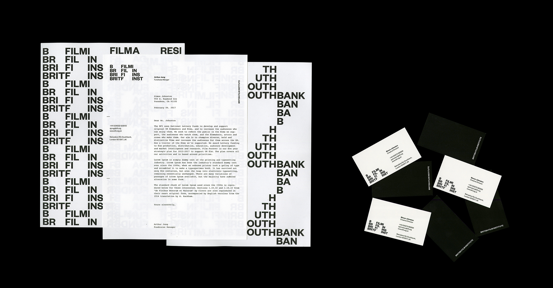
It’s rare to see graphic design students produce truly comprehensive rebranding projects. It’s rarer still to see one at a unquestionably professional standard, by a nineteen year old who has been studying the discipline for just two years. Step forward Art Center College of Design’s Brian Cho, whose British Film Institute proposal for his ‘Identity Systems’ class oozes class and leaves no stone unturned with an 88 page brand manual.
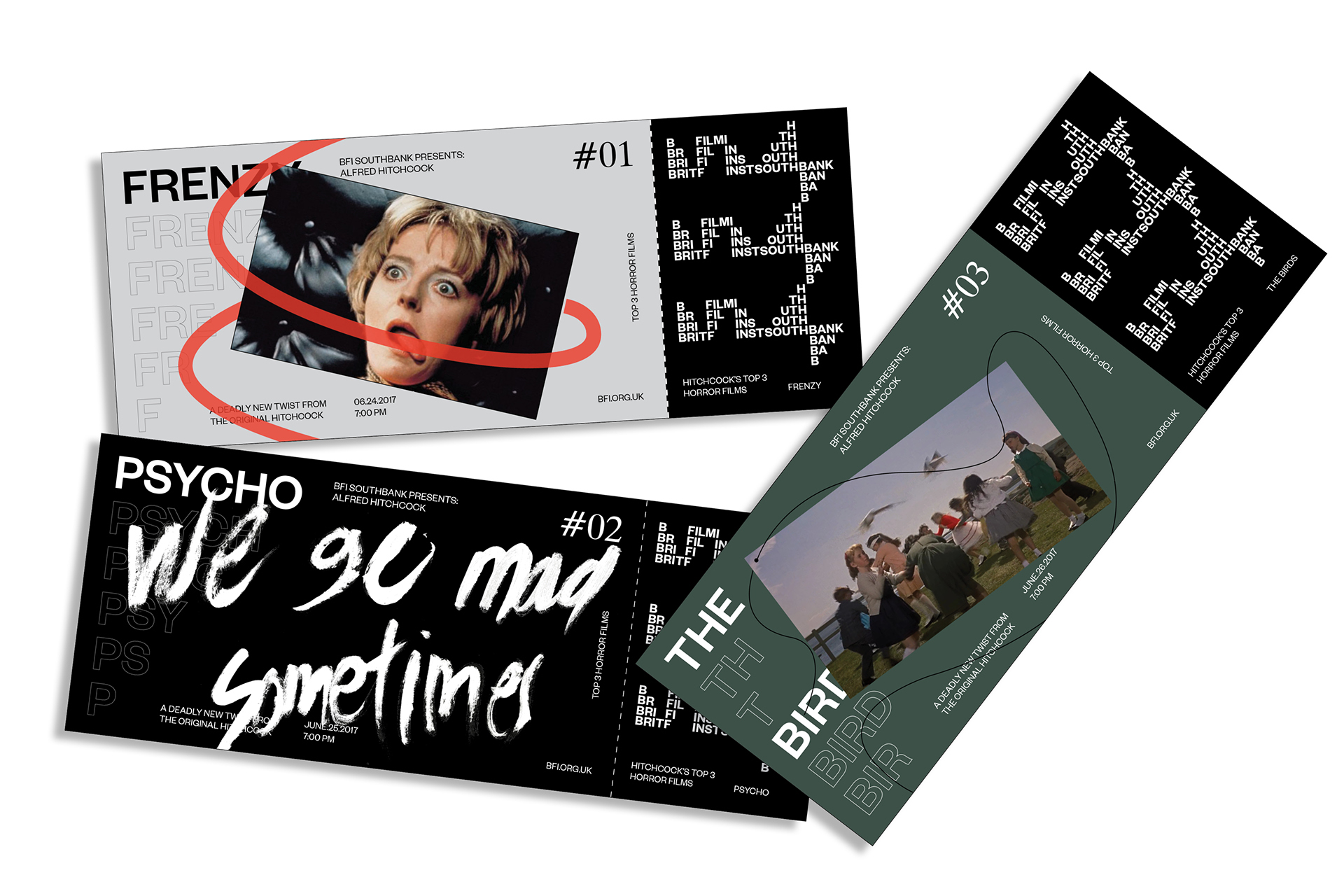
Presented with three options by tutor Simon Johnston — whose guidance and support was “invaluable” — Brian decided on the BFI as he wanted to “create a visual identity that embraces flexibility and adaptability over corporate consistency”. The opportunity to play with and respond to the motion, symbolism and craft of cinema within the project further sealed the deal. Determined to make movement a core element of the identity, Brian extensively researched the history of the artform. Upon discovering the Kuleshov effect, he became “fascinated by how simply juxtaposing images with different and repetitive images could directly and easily manipulate the audience’s emotional experience”. It’s a tool he uses to great effect in applications that feature cult moments from 21st century cinema, allowing the visual identity to absorb the mood of the clips.
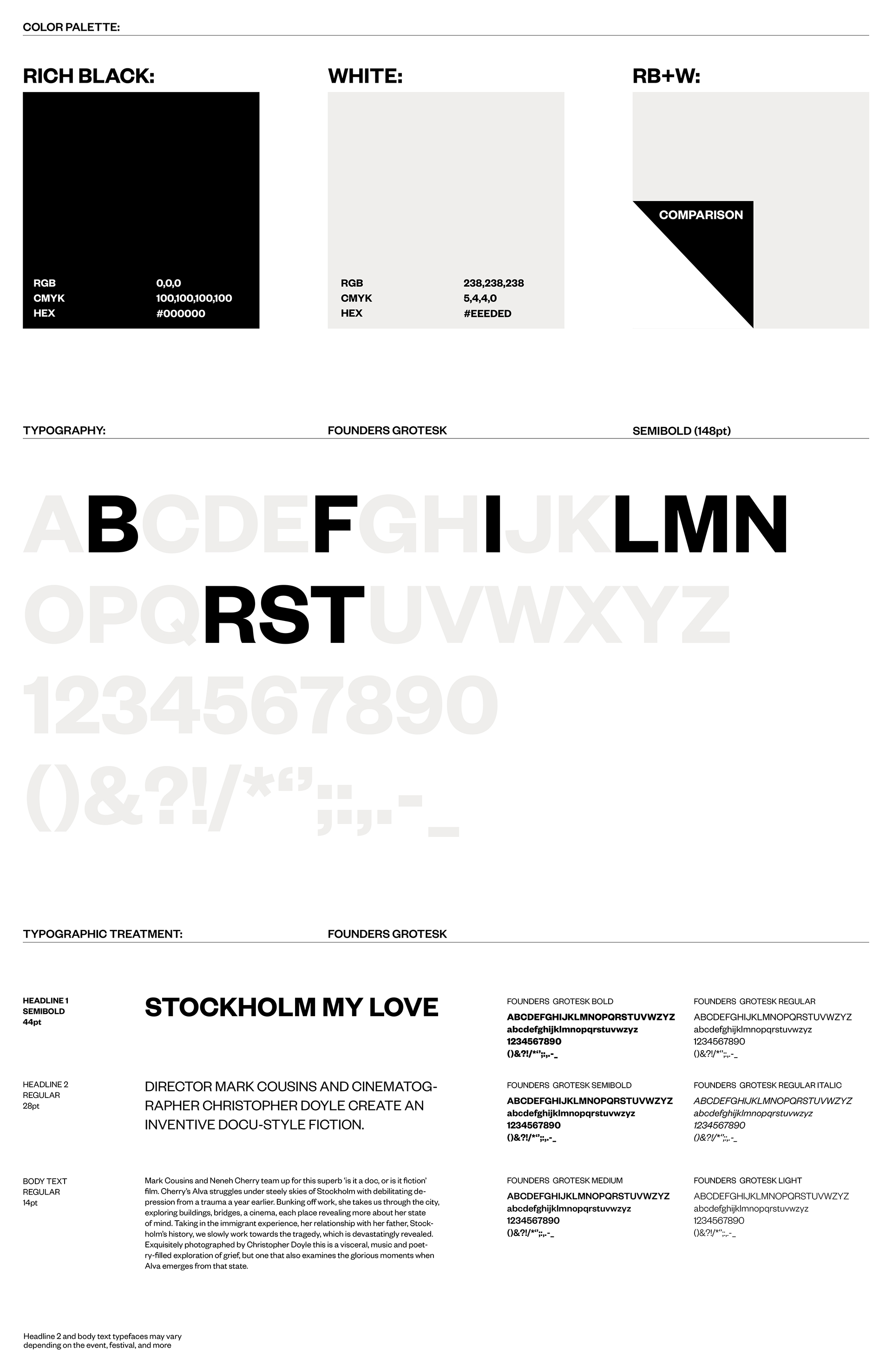
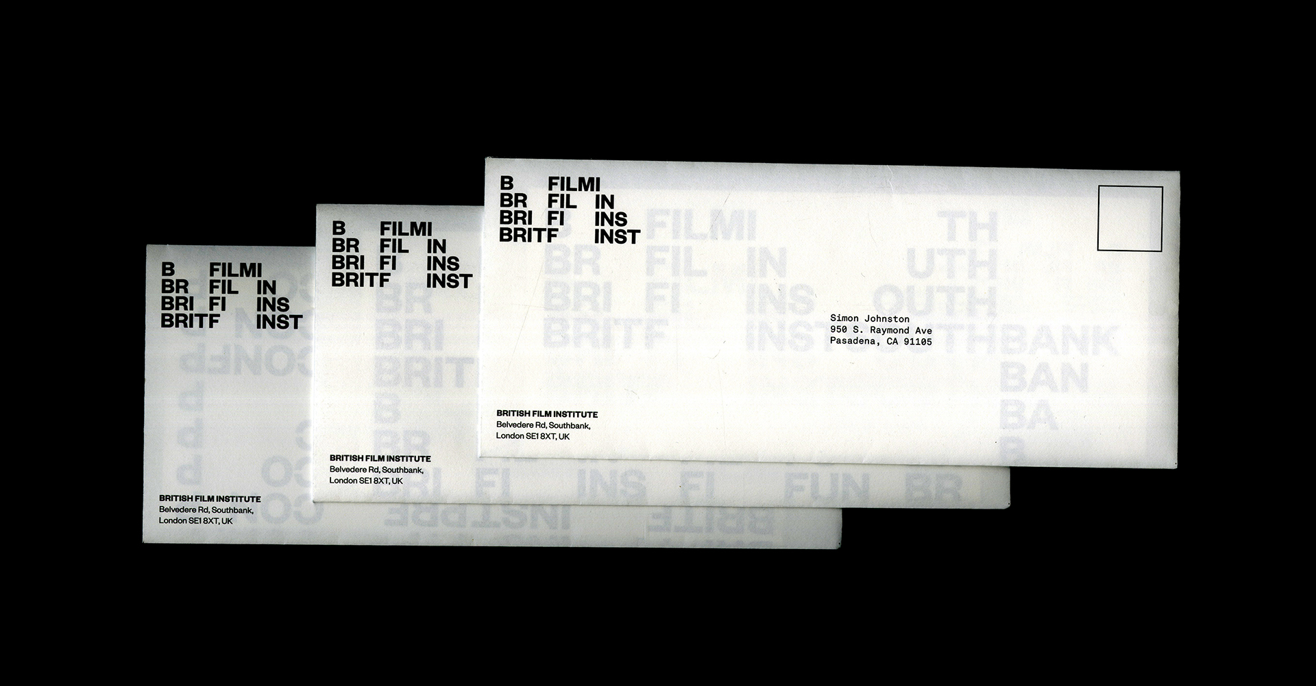
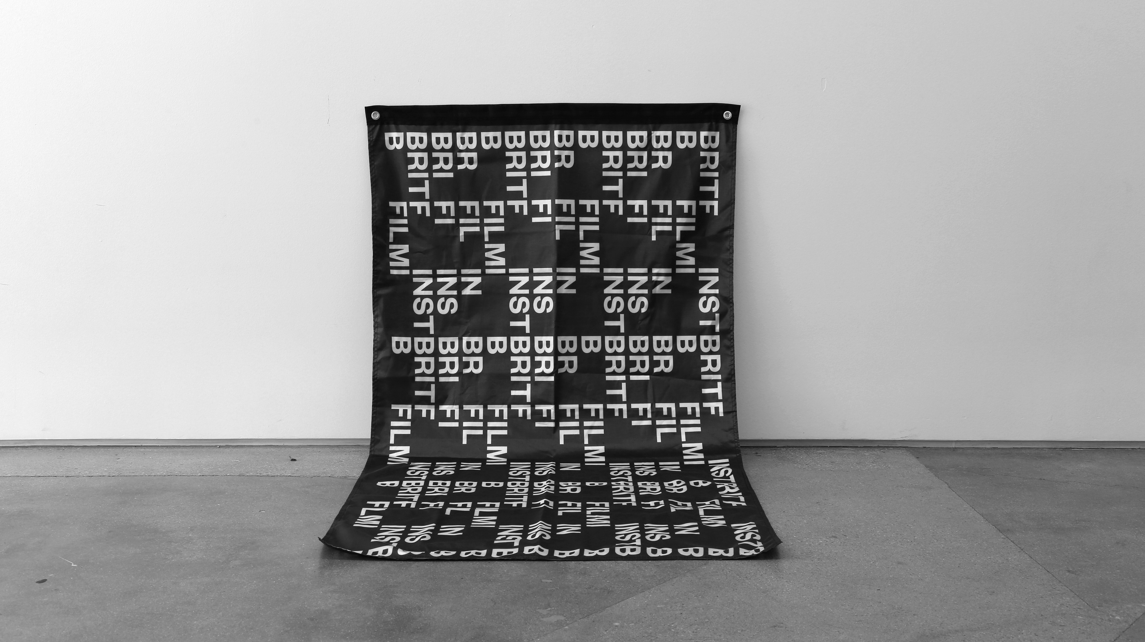
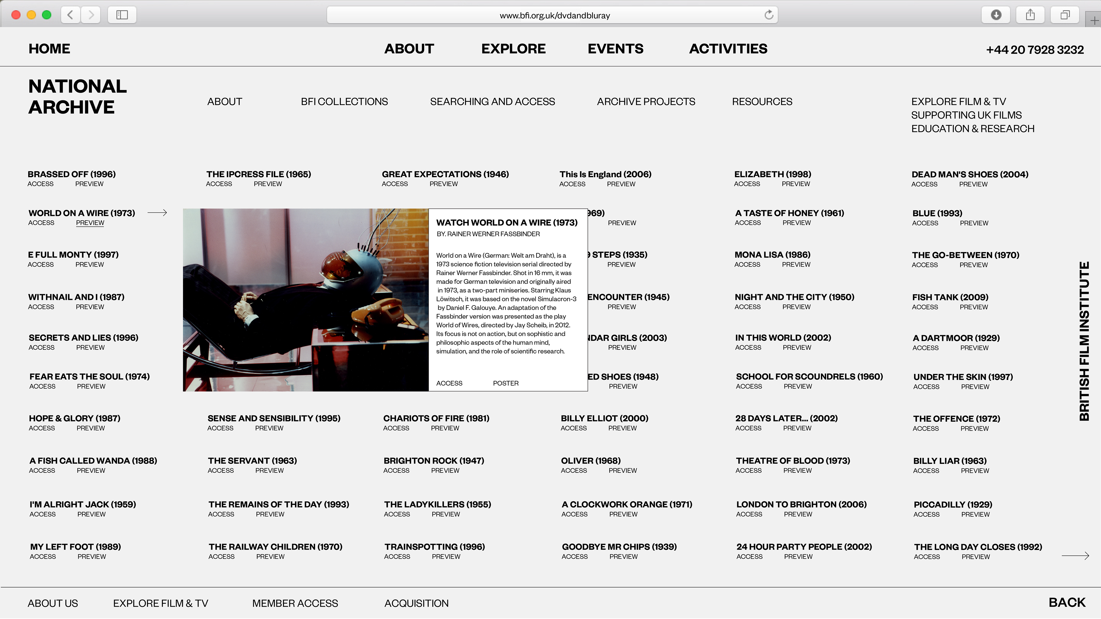
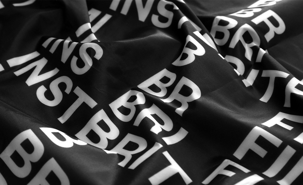
Perhaps even more impressive is the typographic approach, bound by a strict grid yet playfully animated. Not content with ensuring that the abbreviation ‘BRIT FILM INST’ worked and moved beautifully for the logotype, Brian also supplies solutions for a further five departments, each of which have an individual character while falling into line with the overall identity. Mockups are not restricted to basic print and web applications. An entire stationary system is laid out, packaging tape, name tags, posters, tickets, a responsive website and more are slickly presented in this mightily impressive fourteen week project.
Brian feels that he still has a long way to go and has been spending the summer working as a teaching assistant on two units at Art Center. “I wanted to learn more extensively about typography and editorial design through critiquing and seeing various students’ work” he explains. “Exposing myself to different styles really helped me to grow as a designer. I started to accept different approaches, but most importantly, I started having a broader perspective on design”. With freelance work keeping him busy as well, Brian is immersing himself into the craft and it’s clearly paying off. His dream is to design for Nike’s basketball department so that he can combine his love for the sport with his fascination with his craft. “The whole idea of my design potentially changing people’s lives, encouraging them to go out there and exercise, fascinates and excites me”.
Alas, we don’t do the hiring for Nike’s in-house creative, but if we did, Brian would be sitting pretty high on our list.


