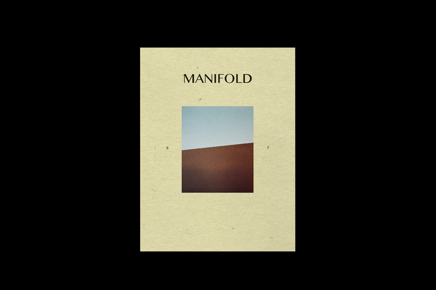
Curtis Rayment
The Winchester School of Art graphic design student investigating the physical and digital manipulation of typography
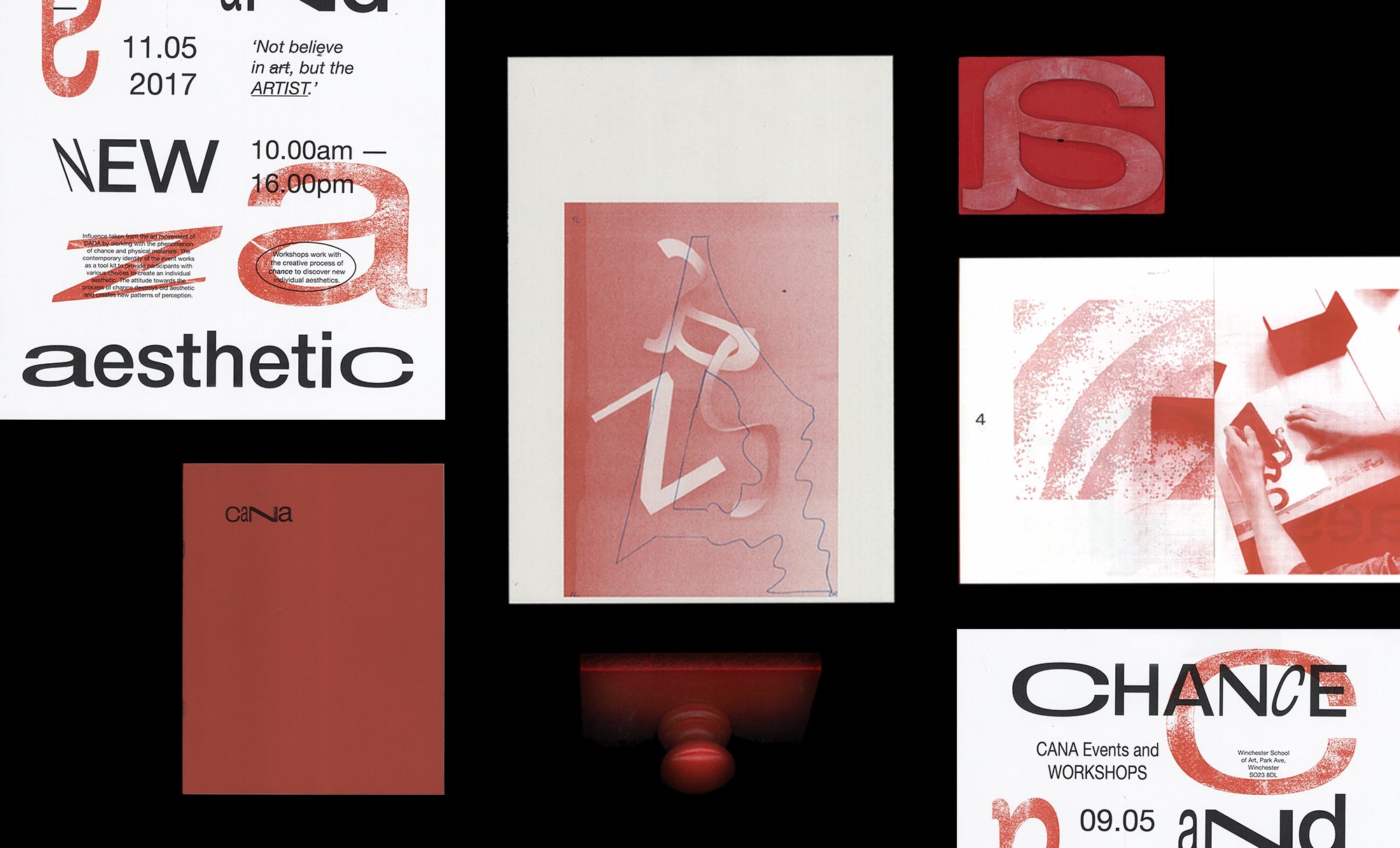
One great foundation to a graphic design identity is an eye-catching use of typesetting and that’s exactly what brought the work of third year Winchester School of Art student Curtis Rayment to our attention.
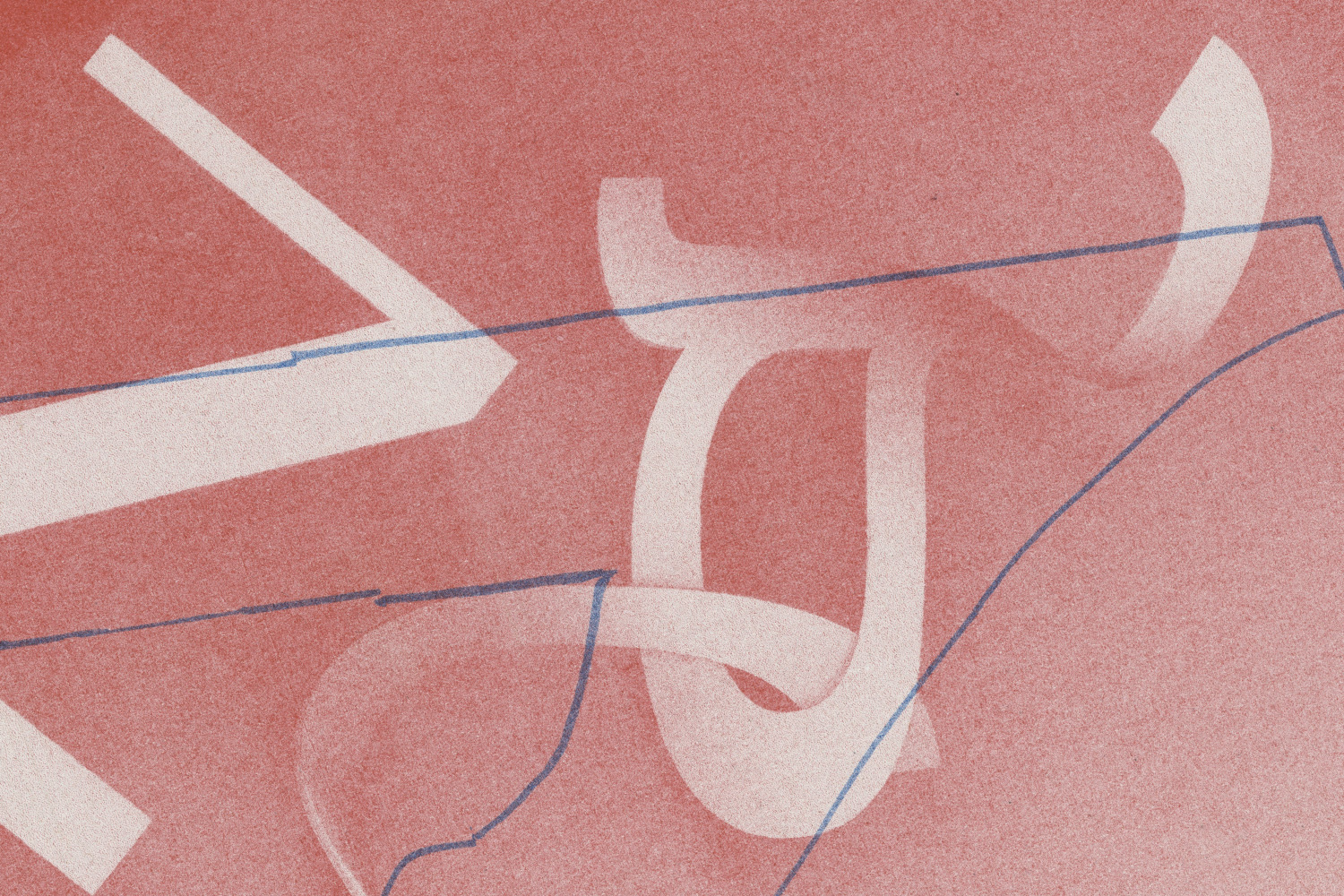
Curtis’ interest in graffiti paved the way for his degree choice, as he was captivated by the the opportunity to break traditional norms of type, instead enhancing it as an expressionist art form. “I would continuously fill sketchbooks with a variation of different designs”, he tells us, “I loved how artists would deform lettering and give it a sense of scale and character by making it 3D, by adding colour, shadow and effect. This is what led to my interest in typography”.
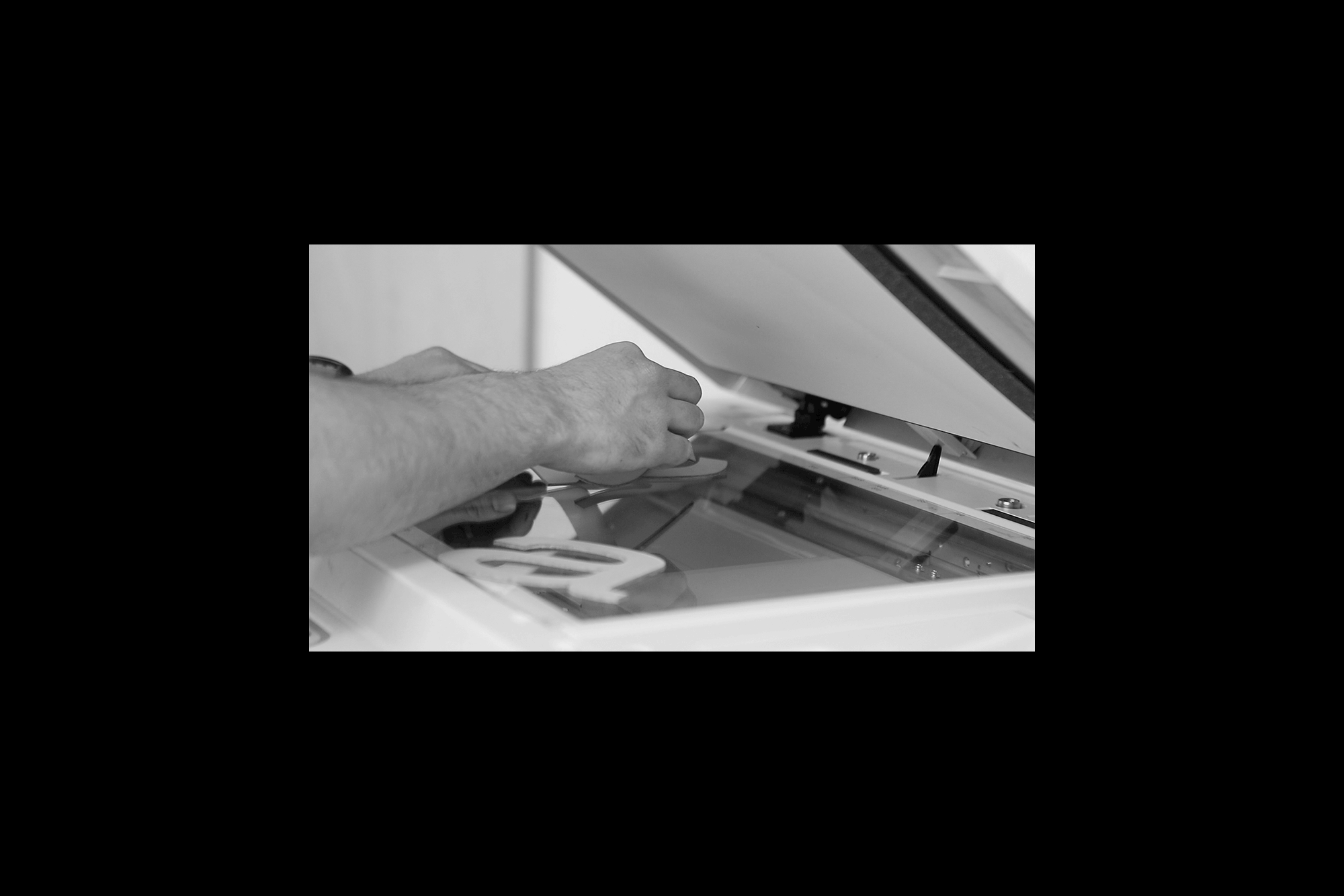
Alongside graffiti culture, Curtis cites the influence of his father’s hands on ‘if its broke, fix it’ attitude as the stimulus for his multidisciplinary, DIY approach to his practice. His work is a clever combination of traditional type and print methods adapted to reflect the contemporary visual style of today, creating a off-kilter nostalgia to his aesthetic. It’s a philosophy that he holds dear, believing that “as creatives we should be able to work between different platforms, both digital and physical as it is a way of building a stronger concept”.
Research and an understanding of traditional techniques strongly underpin Curtis’ practice and way of working, yet his idiosyncratic means of interpreting, juxtaposing and bending those rules that makes his work so engaging. For Curtis this approach results in “happy accidents”, but his output demands far more credit than that.
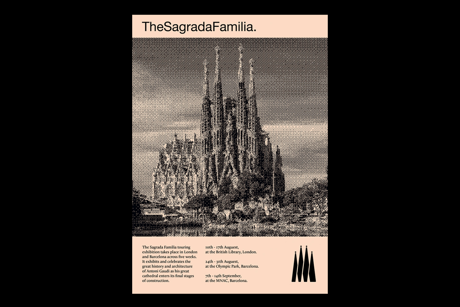
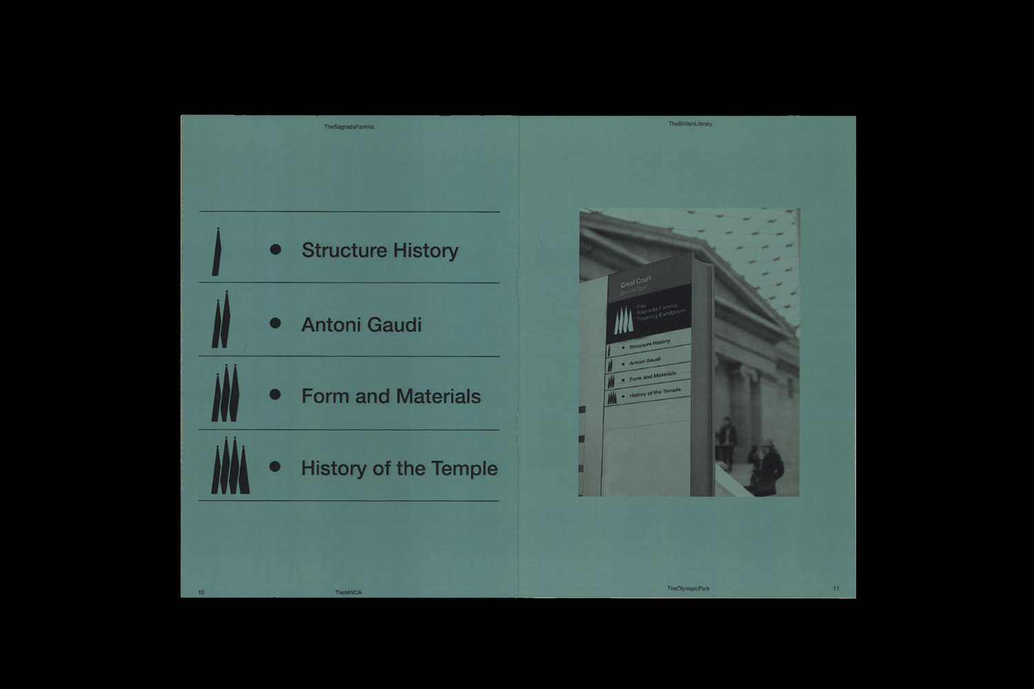
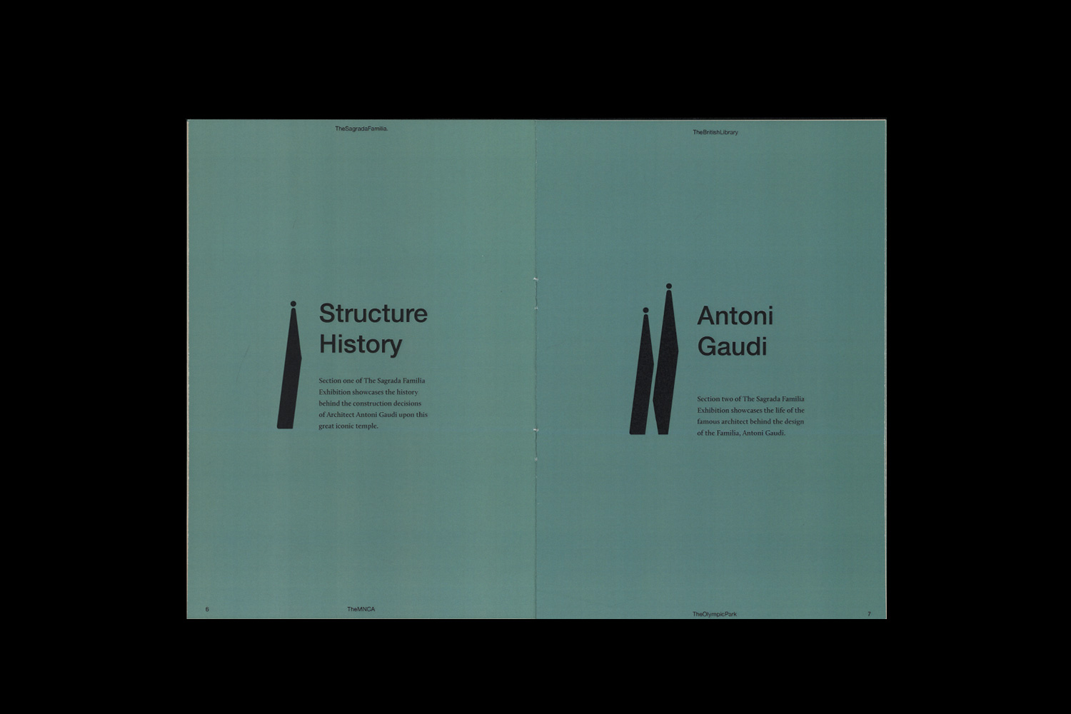
One of his strongest projects is a result of a first term exhibition identity project, in which the objective was to create a communication piece by using a location in Winchester as inspiration. Choosing Winchester Cathedral as his starting point, Curtis created a simplistic and strong graphic identity for Gaudi’s iconic Sagrada Família in Barcelona, to coincide with an exhibition that celebrated the landmark entering its final stages of construction. “I wanted to communicate the building process of this great cathedral”, he reflects. “To do so I split the icon into four sections, which act as a system enabling each level of the exhibition to be recognised through the number of elements shown”.
About to embark on his final year of study, with a breadth of upcoming projects in the pipeline, we’re sure that Curtis’ distinctive practice will be demanding further attention in the very near future.