Johan Elmehag
The Malmö University graphic design graduate turning future coastlines into letterforms to visualise the effects of climate change
When asked about the earliest influences that shaped his ideas of creativity, Johan Elmehag effortlessly recites a list: a poster — designed by H. C. Ericson for Lammhults Möbler — he discovered in a friend’s house, the inspiring music of Thibo Girardon aka Panda da Panda and the Swedish model Anders Lindström who lives in a cave. Both Johan’s words and the themes he chooses to work with reflect a sense of maturity far beyond his years. This particular trait shines through in his recent adventure with typeface design, that focuses on climate change and melting ice caps.
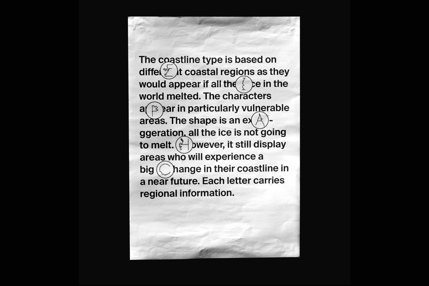
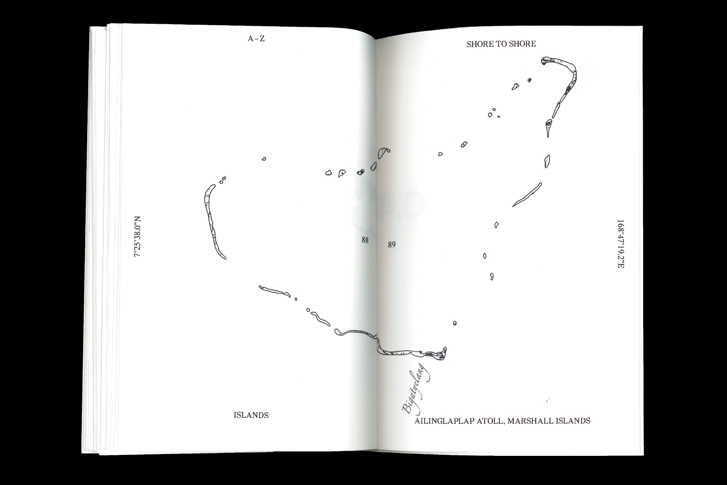
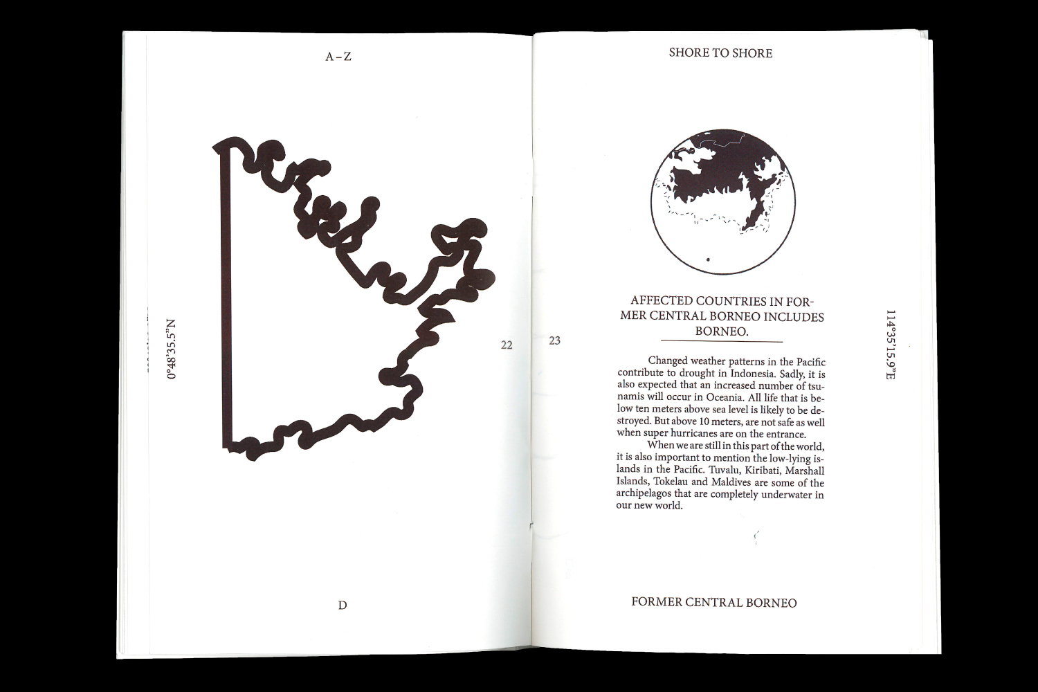
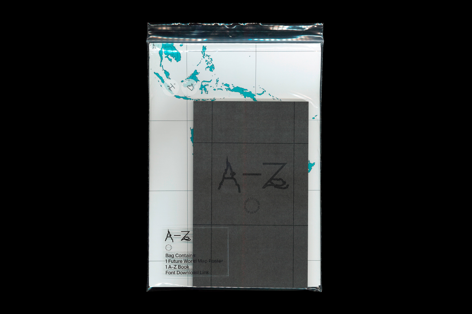
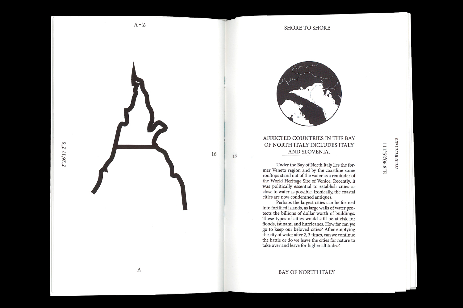
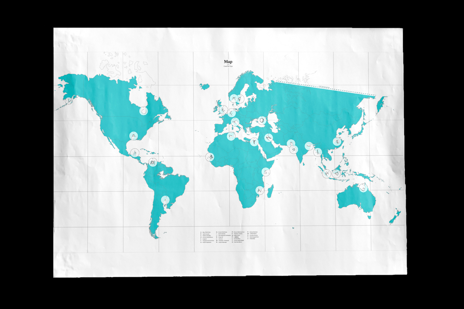
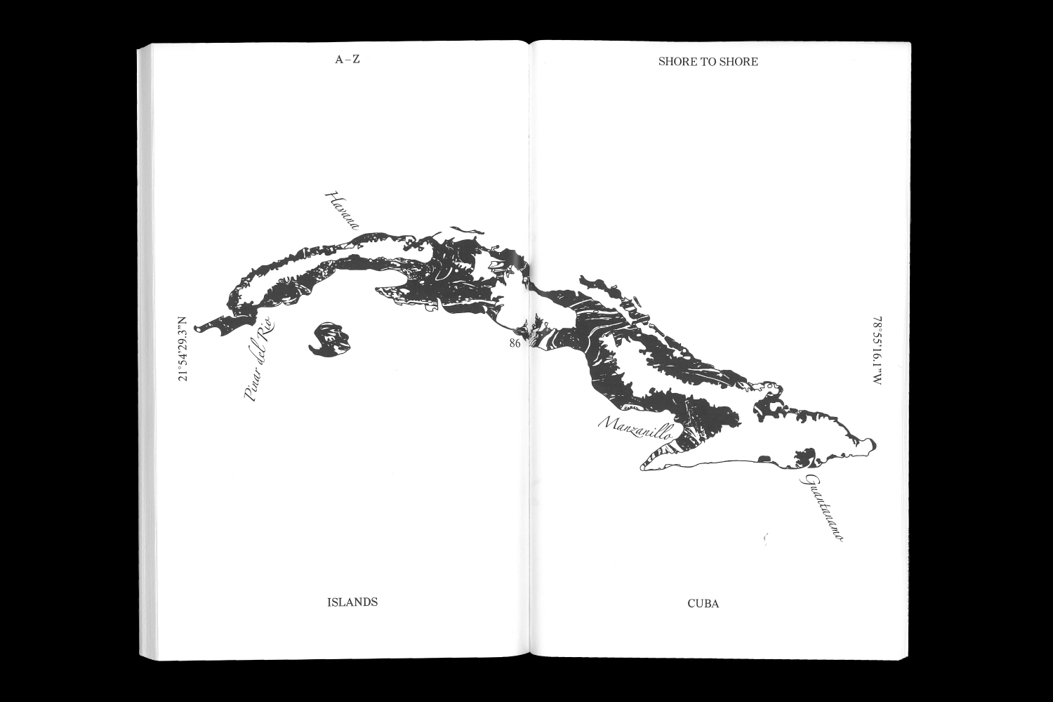
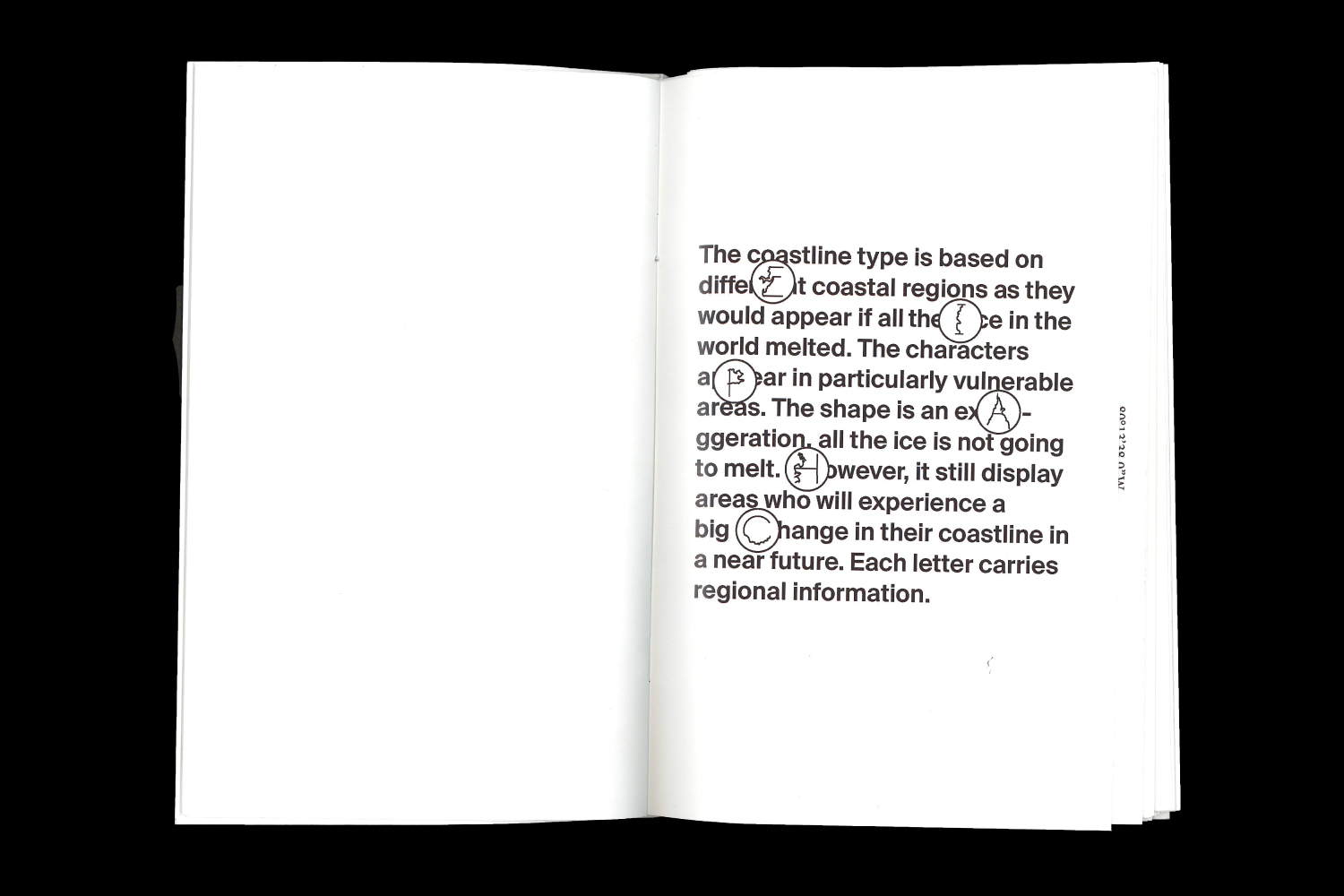
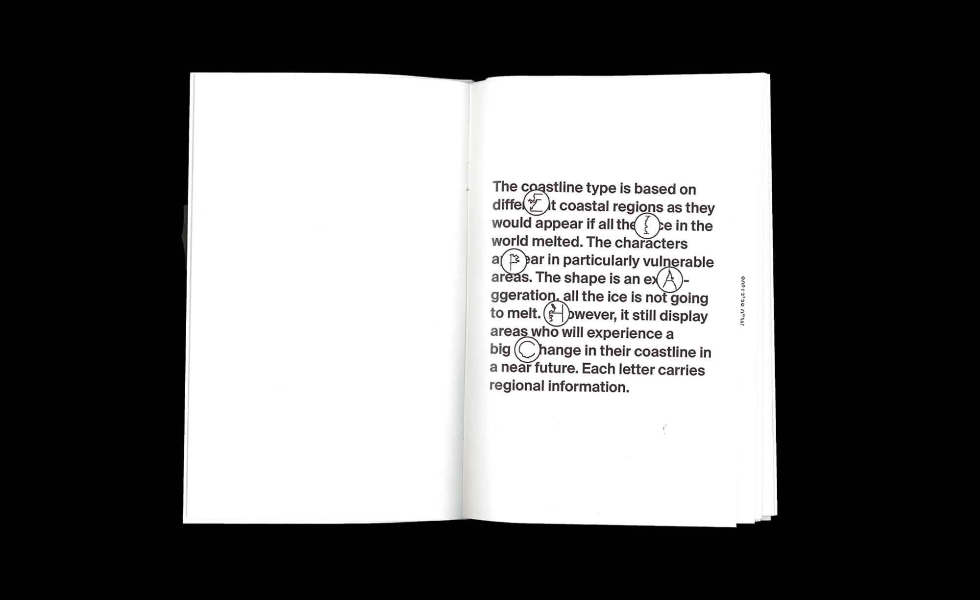
Inspired by the general dearth of projects centred around climate change and the sterility with which such information is handled, Johan decided to create a custom typeface that tackles the subject with wit. In ‘A-Z: Coast to Coast Shore to Shore’, the recent Malmö University graduate creates a future world map, a publication and ‘Coastline’, and a typeface that represents the geographical impact of climate change by turning future coastlines into letterforms. The idea was sparked when Johan mapped out what the Earth would look like if all the ice in the world melted, and then began noticing hints of letterforms in particularly exposed coastal areas.
Staying true to the essence of a designer, Johan began this project with a design problem, focusing on the why rather than the what. “When I started, I didn’t know what form this idea would take; I was only concerned with the purpose. I delved knee-deep into research, collecting spatial information of how the world would look if all ice melted. I constructed my ‘future’ map using information from floodmap.net and stats from National Geographic. My map is based on around 30 images and took about one week to draw,” says Johan.
The letters demonstrate some shocking facts: ‘U’ talks about Mexico being split into two halves due to rising sea levels; ‘O’ shows us how the Black Sea flows into the Caspian Sea, changing underwater life forever. What underscores Johan’s true genius is not just his sharp focus on the central subject, but the space he builds for larger questions. ‘Q’ marks the birth of a new island, created when the peninsula of Kathiawar in northern India gets enveloped by water. “May these new landmarks be subject for new nations?,” asks Johan. “There are uncountable stories embedded in these letterforms. However, in the long run, it’s important to remember that the environment doesn’t care for borders,” he adds for good measure.
In between juggling the launch of a type foundry called FoundFound, which will soon release a typeface by designer Alexander Örn, Johan lets us in on his plans to move into the woods to start farming vegetables. “I’ve been gravitating towards organic processes and analogue techniques. I’m interested in exploring fungi, flower pigments, the concept of time and systems in nature through my work in the future,” adds Johan. We can’t wait for what he creates next — whether that be a vegetable patch or another groundbreaking design project.