Mo Samad
Explorative yet, sharp graphic design from the final year London College of Communication student
Mo Samad adopts an inquisitive yet, challenging approach to design, which in turn informs his dynamic style. When Mo first began designing, he was keen to learn the rules and principles of graphic design. Mo reveals, “I wanted to learn the fundamentals of grids, type, and layout. Now that I have more of an understanding of the rules, it allows one to start breaking them in a more controlled manner”. Mo’s growing portfolio is a credit to his design practice. His ruly commitment to design, will serve him well, as he currently studies in his final year at London College of Communication. Last year, on a sandwich year between studying – he fondly reflects on his time as an intern with Spin, working on their Unit Editions and a brief stint at Accept & Proceed.
Despite, Mo’s expansive body of work, he discovered graphic design a little later than you might think. After leaving school, Mo tolerably navigated working life from admin office roles, to a job in construction. That was until he attempted to start a t-shirt business and, although this was unsuccessful – it planted a seed of curiosity for design. Mo’s first steps in design, he owes to his friend Callum Rowney, who, back then was in his second year at university. Mo’s passion for design, happily merges into his downtime as he discloses to us, “For me, design became something I would do for entertainment instead of watching TV or playing FIFA, I would spend my evenings designing which allowed the technical side of design to develop”.
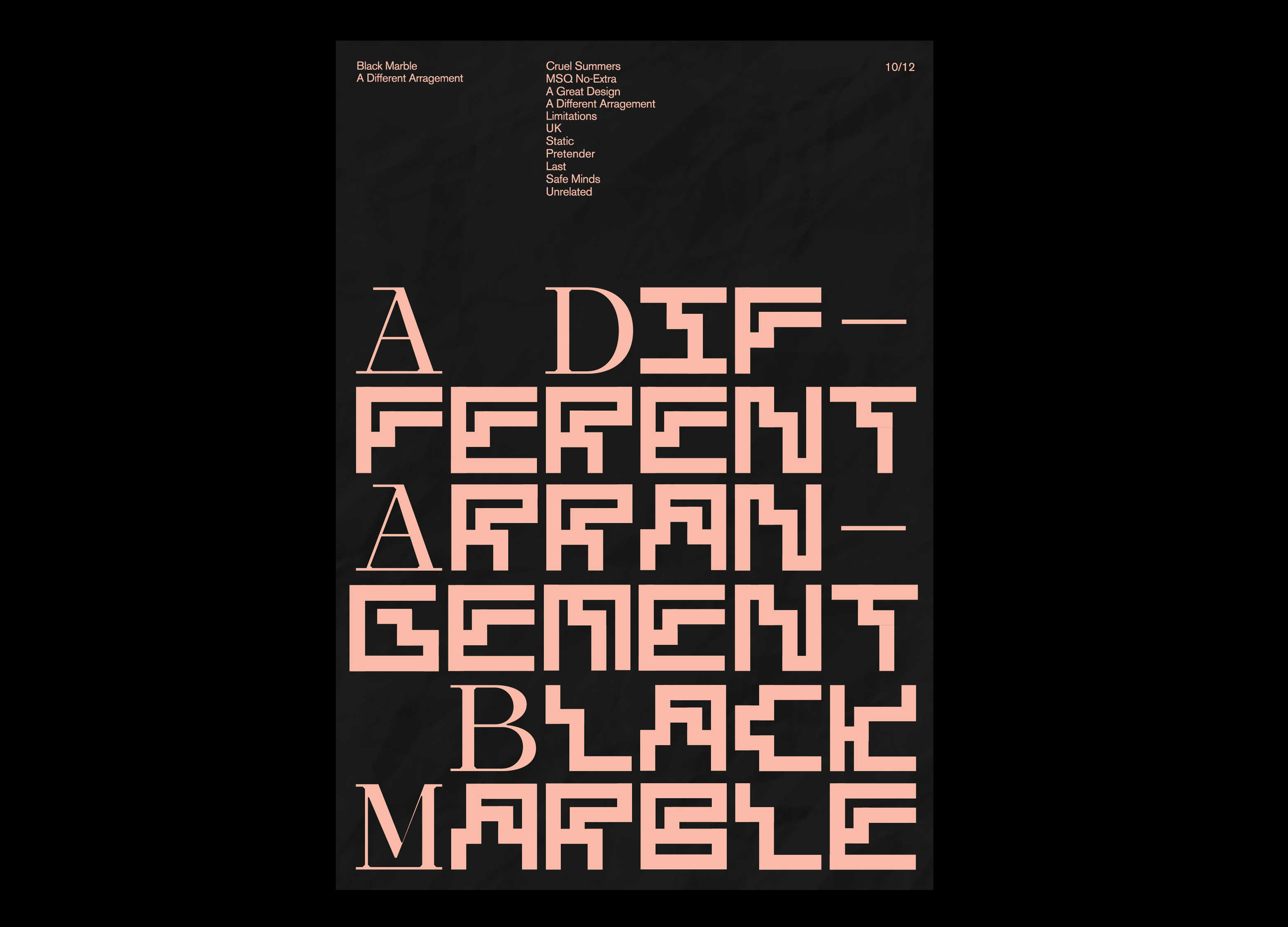
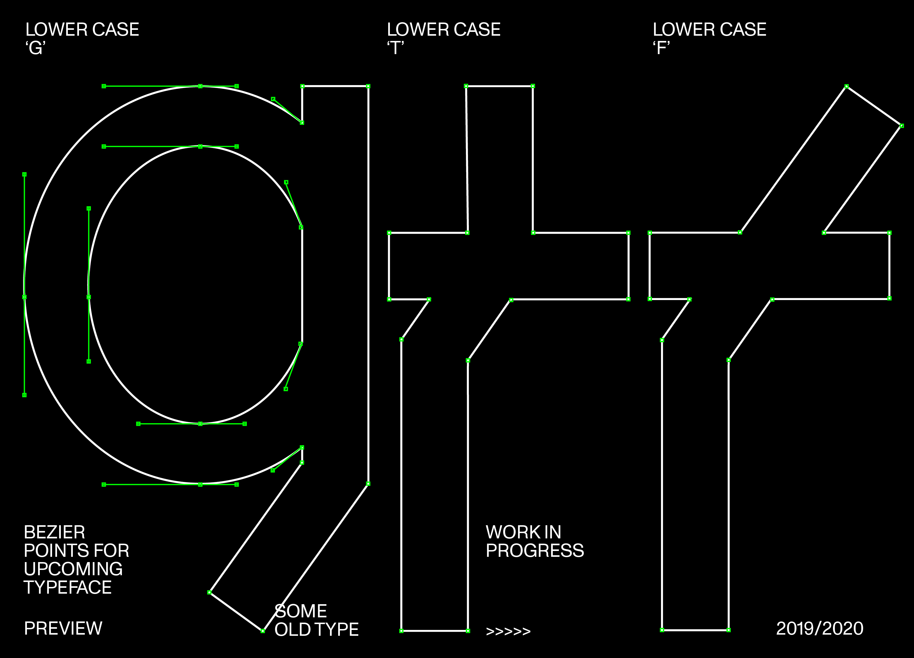
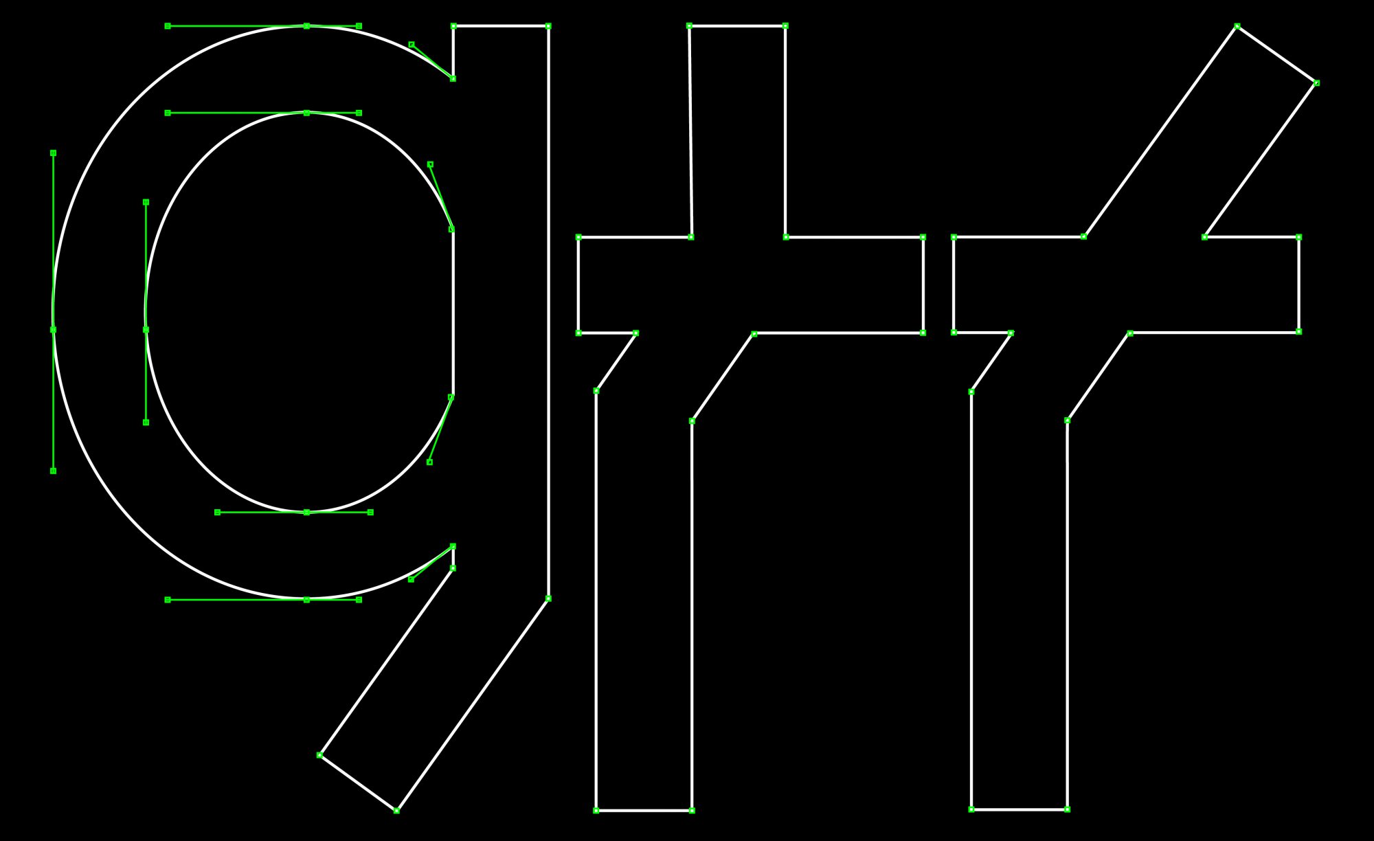
Mo generally explores design through typography, where he tends to see an opportunity to make new and unusual forms. Mo explains, “There is a universal acceptance of what a letter ‘a’ is; but what I find interesting is within the rules of what a letter ‘a’ is how can you alter the normalised structure to become something still recognisable but have overtly broken the standardised forms of that letter; I feel like this is the basis for most of my work”.
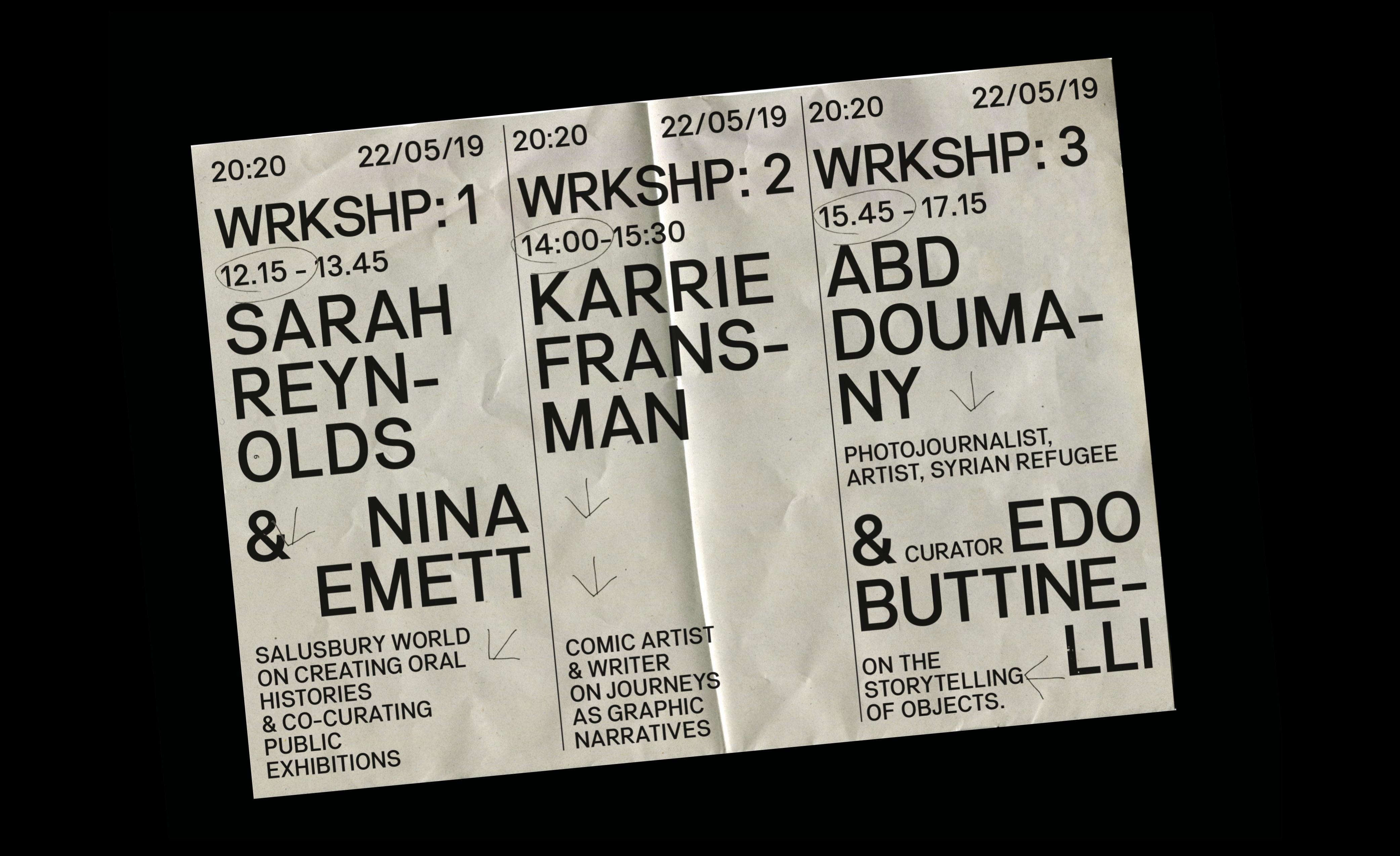
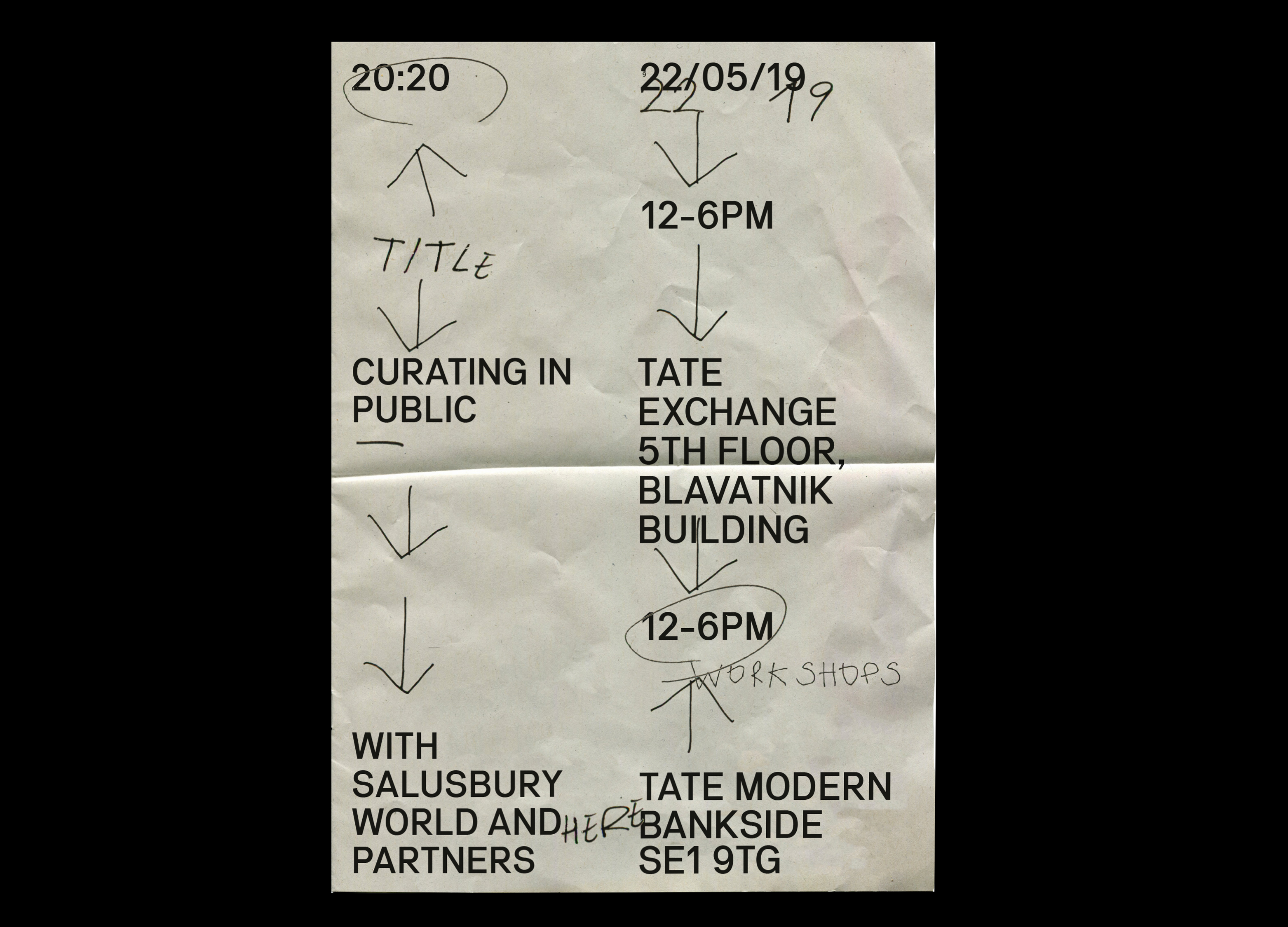
Recently, Mo designed the identity for an exhibition hosted by the Tate Exchange, at the V&A for London Design Festival. The exhibit explored the stories of 20 refugees that arrived in the UK 20 years ago and aimed to challenge the portrayal of refugees seen within the news. Focusing on the news format, Mo used newsprint as a material basis for the identity. As a token for information, Mo felt the newspaper-style would communicate his identity most appropriately. Continuing his interest in socio-political issues, Mo intends to incorporate more of this into his upcoming design work. He is currently working on a publication for the writer: Araceli Irurzun Pérez, who has written an essay questioning if there is a shared meaning to the concept of solidarity within Europe? This is due to be finished at the end of November, so keep a close eye out for the release. It’s sure to be an explorative yet, progressive piece and we can’t wait to see it.