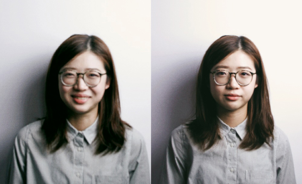
Meet the team: Vincy Cheung
Now in her final year at Parsons, we see what the brilliant young illustrator is working on
I vividly remember discovering Vincy’s work on the Parsons website where she had been selected as student of the week. A couple of emails and a conversation with the boys from DR.ME later, I realised that she was interning with Mike Perry when DR.ME were working with him in NYC.
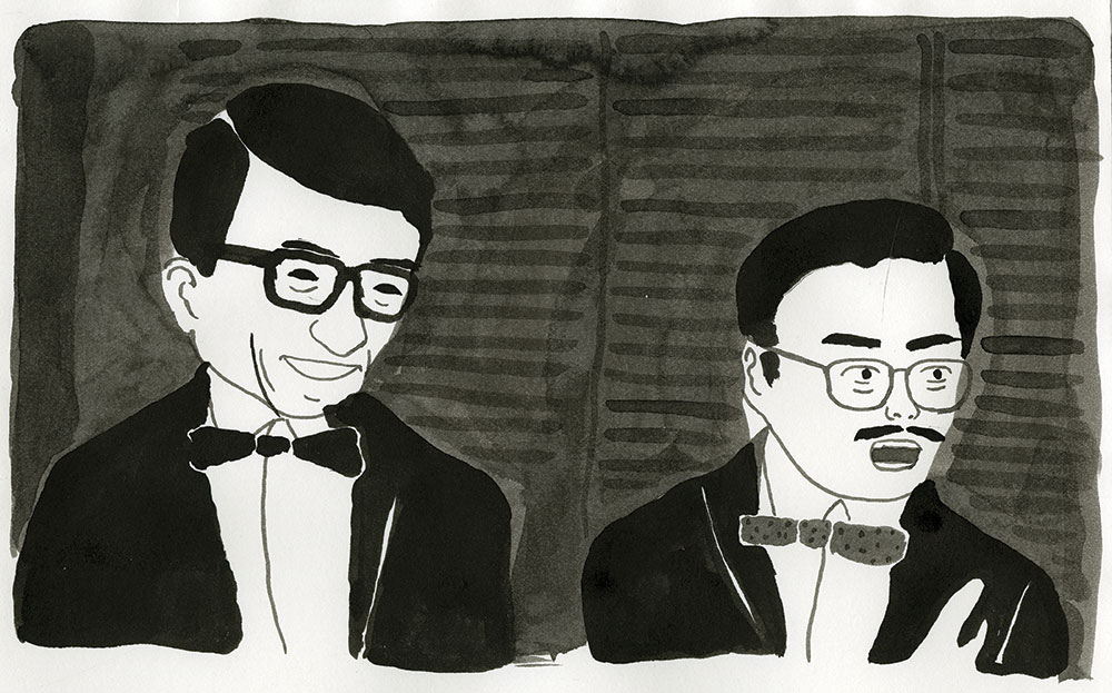
I knew from the moment I first checked her site that I wanted her to be part of Issue One and she did some amazing work on our D&AD feature. The real treat though was seeing her interview alongside Mike come together. It was the first time I had arranged a transatlantic interview. Five people who I had never met, coming together in Bushwick for a couple of hours in the hope that we would emerge with a story. That story ran in the centrefold of Issue One as Ella, Anna, David, Mike and Vincy all did me proud.
It was a pleasure to catch up with Vincy this week to see how she was coping with the pressures of her studies and what she had planned for the future.
When we interviewed you in Issue One, it was about being taught by and subsequently interning for Mike Perry, that was in your first year at Parsons, how are things going in your final year?
Final year has been pretty hectic for me so far. As well as developing our senior thesis projects we also have to start preparing to make our professional bows as artists and illustrators in the industry. After studying illustration for three years I keep on wondering if being an illustrator is the best thing for me, especially after learning more about what it’s like to be a freelancer. This year I am also spending more time refining my portfolio in order to present my work better. That’s why I’m not interning this year, because my portfolio site is kind of broken now (oops). I’ve had some comments from the teams at Pixar and Apple about my work being too stylised and difficult to adapt into practical use. Since then I have been thinking about how to better present work on my portfolio site (or not, maybe those companies are just not for me).
Vincy Cheung,
2014
Mike is a great example of the calibre of teachers that Parsons boasts, how have he and the other instructors helped you develop over time?
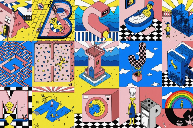
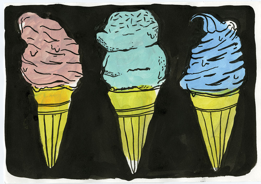
The Illustration thesis project is a great chance for students to produce a series of work purely of their own interest. Instead of sticking to one idea for my senior project, I started to experiment more with different methods and mediums and I’m having a lot of fun making them. Taylor McKimens is the instructor for my thesis class and he’s been very helpful on assisting me with ideas. He shares a lot of his own experience and opinion as an artist and also introduces the class to a lot of other artists, which is great. It’s also pretty exciting that the illustration department have been more enthusiastic about helping students to get their work in front of a public crowd than before. We’re having a illustration show soon at a gallery space in Brooklyn owned by Urban Outfitters which could be great exposure. I also participated in a self-publication fair called MoCCa Fest recently which is also a great chance for me to learn about what kind of work attracts a wider audience.
Vincy Cheung,
2014
Have you had much time for freelance work since moving into your final year of studies?
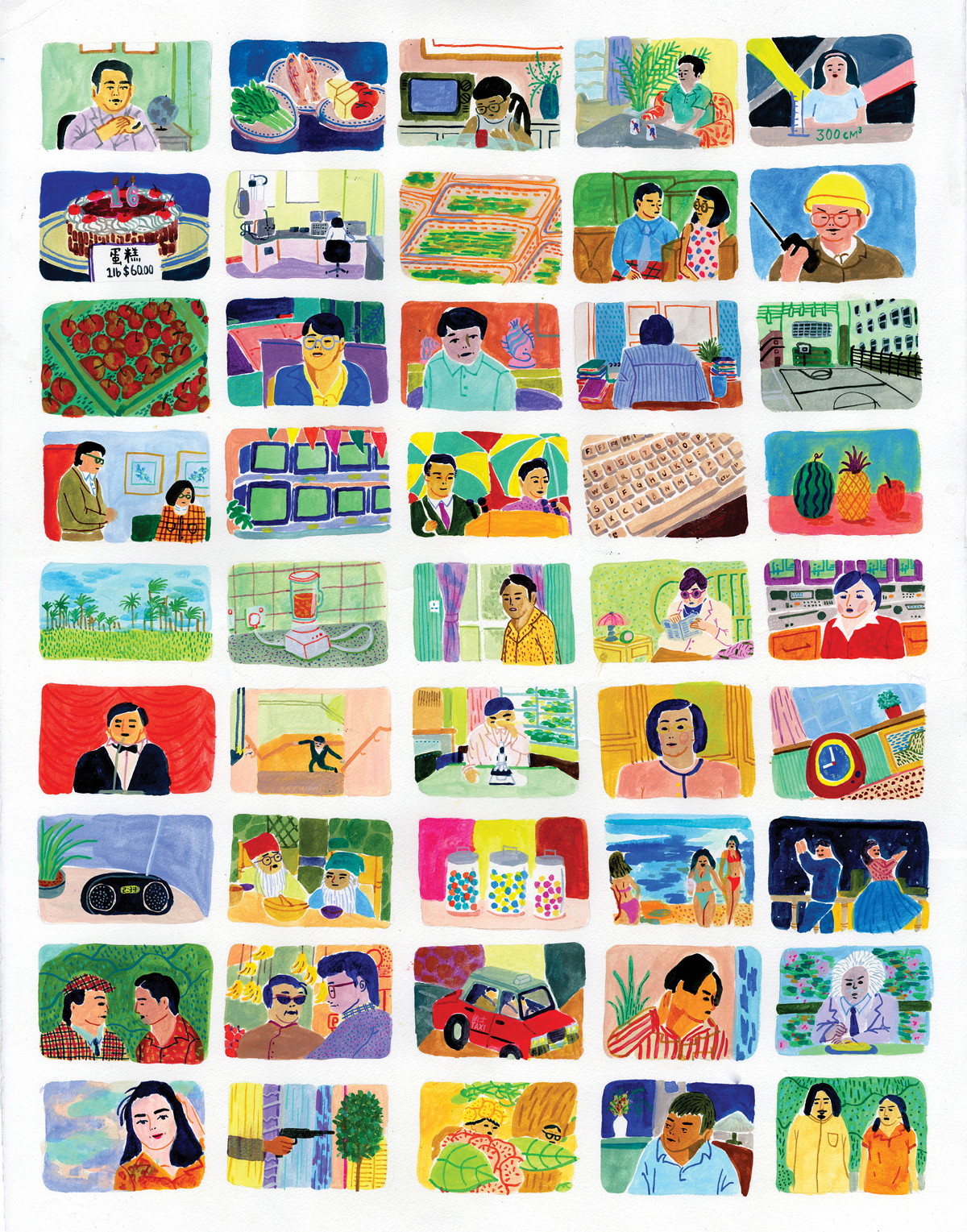
In terms of freelancing and commission works, I’ve had a couple of inquires but they ended up not happening. That’s fine with me because I am happy enough when there are people outside of school who are interested in working with me. I also got some inquiries about selling art prints of my illustration. Since I don’t have a web store yet, I might work on that in the future.
Vincy Cheung,
2014
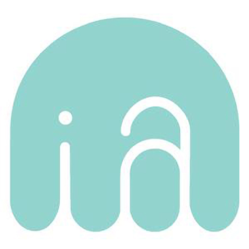
You recently created the logo for Interns Australia, a group started by our Issue One Editorial Assistant Colleen Chen, what inspired the elephant design?
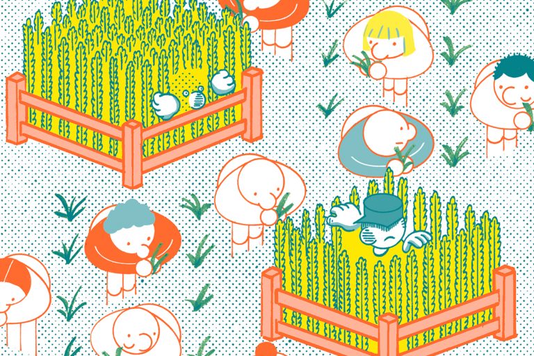
Working with Colleen on the logo design for Interns Australia was a fun experience for me. At first I was nervous about the job since I wasn’t very confident in logo design, but Colleen was very friendly and encouraging throughout the whole process. I sent two rounds of sketches to her and she was drawn to the design that looks like an elephant, which is not intentional. After a few adjustments, we had the final product. My initial idea for the logo was based on the form of the letters with the intention of presenting a softer image. In the end it looked kind of like a elephant and that fits perfectly with my initial idea as elephants are friendly animals.
Vincy Cheung for Interns Australia
So what’s next for you once you graduate? Are you looking to stay in NYC and work as a freelancer or do you have other plans?
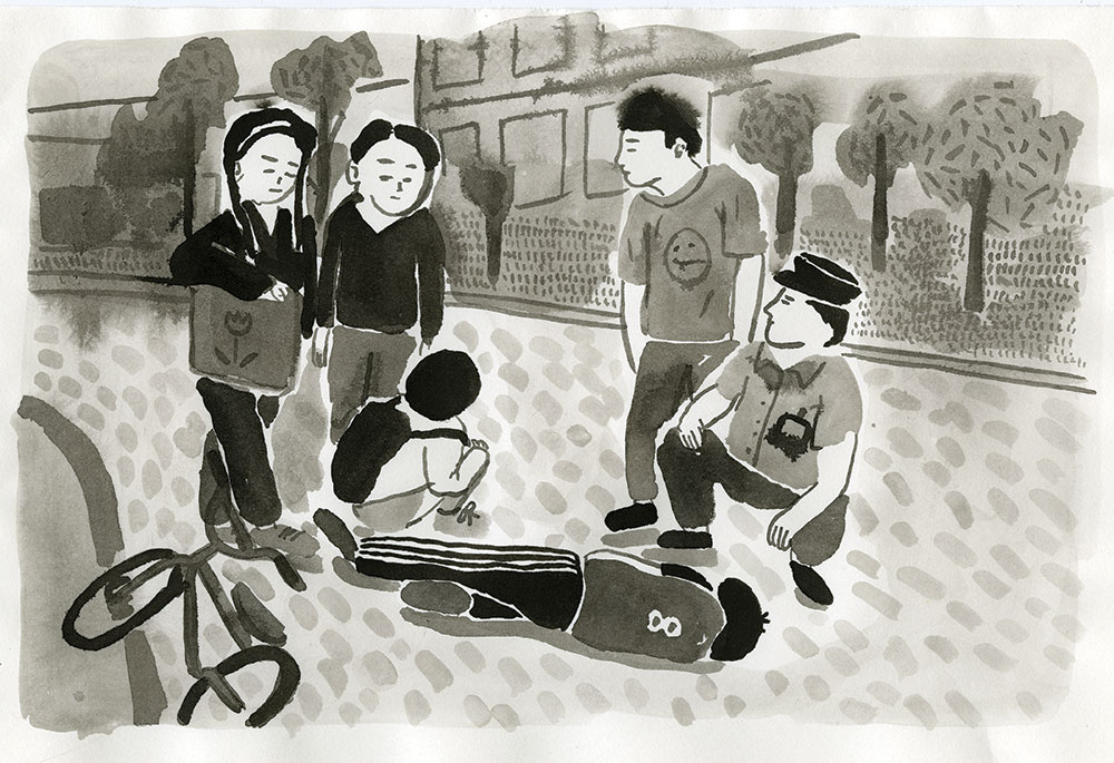
Currently I’m working on getting my visa for after I graduate, hopefully I can find a job and at the same time figuring out what I really want to do. I’ve also considered trying to go to different places, perhaps the UK, but I still have to figure out how it’s going to work out. Right now I am really open to any opportunities, but so much so that sometimes I feel a little lost!
Vincy Cheung,
2014
_______
I certainly hope that Vincy doesn’t feel lost for long and I remain supremely confident that she has a bright future as an illustrator ahead of her. Broken or not (I don’t think it’s in bad shape at all), if you want to check out more of her work, I heartily recommend doing so via the link below.


