Meet the team: Alice Tye
We quiz the Issue Three illustrator on her freelance career, style and Californian inspiration
Alice is unique when it comes to our family of contributors, she’s the only person that’s been featured twice in the same issue and with good reason. It was February last year when she first got in touch and instantly her rich painterly style demanded inclusion in the magazine.
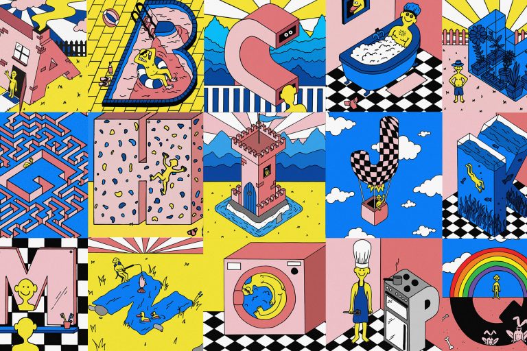
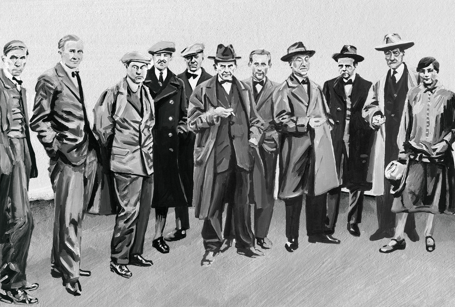
As we started to discuss her involvement in Issue Three, her experiences at Camberwell Press presented another intriguing story for us to cover. The studio, run out of Camberwell College of Arts was a great fit, especially considering the education theme that was steadily starting to emerge. Alice went on to be interviewed as part of that feature while also painting a series of wonderful Bauhaus illustrations to accompany our opening essay by Sophie Lee.
I will always remember seeing her work in the fourth issue of The Gourmand, an image from which you’ll find mid-way through this feature. It was expressive, full of character and really captured ‘The Lost Shops of Soho’ beautifully. In a world of slick digital design and photography, the human touch is often overlooked and one of the great draws of Alice’s work is it’s distance from the digital. As a print publisher I find myself drawn to work that has a physicality to it and again, Alice produces that in spades.
Back in August, Alice spoke at our event at The Printspace and treated the audience to a thoughtful look back on her career to date, along with great insight into the freelance world. This week’s Meet the team serves as the perfect opportunity for us to pass on a few of those words of wisdom from our conversation earlier this week.
For Intern Issue Three
In Issue Three and at our evening at The Printspace, we talked a lot about your time at Camberwell Press. For readers who aren’t yet familiar with the programme, what about it worked out well for you?
Well Camberwell Press is a design, publishing and events studio based in Camberwell College of Art (where I studied for my BA in Illustration). The Press is run by members of staff at the college and part time interns – the deal as an intern is that you work two days a week unpaid for a year. In return you have experience of working in a design studio, organising events etc and are able to use all of the college’s facilities for free. So for me it was perfect, as it enabled me to carry on experimenting with stone and zinc-plate lithography. It also give me experience working on all sorts of projects that helped in making contacts with other designers and educators as well as learning about the logistics of organising events and publications. The other part of what worked for me about the internship at Camberwell Press was that you were treated as an equal – as the Press is largely run by interns – so your ideas as valued and you are part of the conversation not just making tea and running errands.
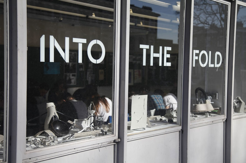
Camberwell Press’ ‘Into the Fold’ launch
Despite that experience, how challenging did you find the freelance world? Were you ever put off by the day-to-day challenges of finding work?
I would say that my time at Camberwell Press – although I learnt a lot and am so glad I did it – didn’t help further me freelance career as an illustrator directly. It’s a scary step moving from making work at college to trying to find work in the real world and learning how to work with clients. I was never put off by the challenge of finding work as I think I entered into the freelance world fully aware that it was going to be really hard work and that it was unlikely I’d be paying my rent purely from illustration commissions in the foreseeable future. There are periods where you just can’t get any commissions and its really disheartening when no one is replying to your emails. However, it only takes one person to reply and like your work to get the ball rolling and all of a sudden, your work is being seen by other potential clients again.
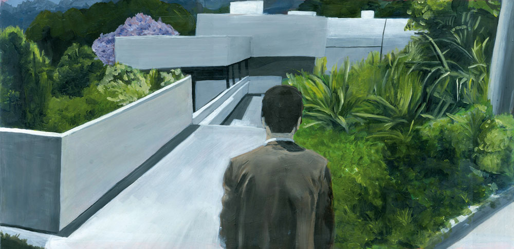
LA Confidential
You were named amongst It’s Nice That’s Graduates in 2013. How useful did that accolade and support prove to be?
I owe It’s Nice That a lot! It really helped me to get my work seen by a much bigger audience than I could’ve managed by myself; and every time they’ve featured my work since I’ve found that I get a lot more emails and enquiries about commissions or painting sales. The team at It’s Nice That are all so nice and are really willing to help you by providing introductions to people you want to work with, so I’ve been so grateful to them for helping me get my work seen!
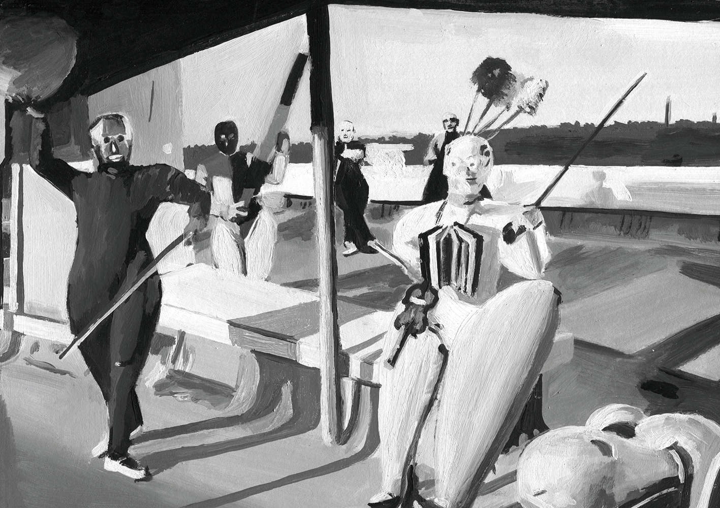
For Intern Issue Three
You’ve worked for some of the biggest magazines out there including The Gourmand and Süddeutsche Zeitung Magazin, what’s the biggest challenge when illustrating editorial?
Personally one of the biggest challenges I’ve had recently has been language barriers and mis-communication as I’ve had a number of commissions from magazines based in Europe and have been given briefs that have been translated through Google translate. It really makes it much harder to get an idea of what they want for the piece when you aren’t speaking in your own language. But aside from language issues I’d say editorial varies a lot as often the client has chosen to use illustration over photography because they want something a little more abstract that can embody the ideas in the article and it can be hard to work out a way to translate that into the way that you work.
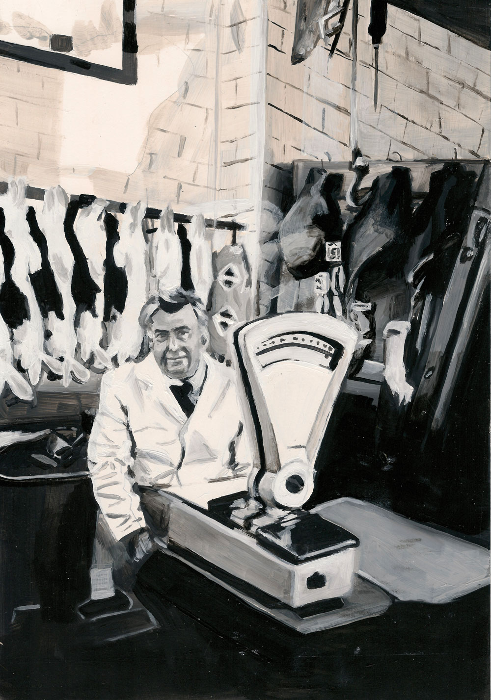
For The Gourmand Issue Four
California is a state that has inspired a lot of your work, is it a connection that you established through popular culture? If so, what films, programmes etc. were major contributors to that?
It was definitely a connection that was brought about by popular culture. I, like most other British kids born in the early 90s, have been watching California represented on TV, in films, discussed in books for as long as I can remember and have always been fascinated by what seems like this magical, glittering place where the sun is always shining and everyone is beautiful. Obviously this is a fiction, its not really what California is like, but it’s what pop culture tells us. I think some of the main films and programmes that influenced me were LA Confidential, A Single Man, Clueless, and when I was growing up shows like Buffy the Vampire Slayer and 90210 really shaped what I imagined California to be like.
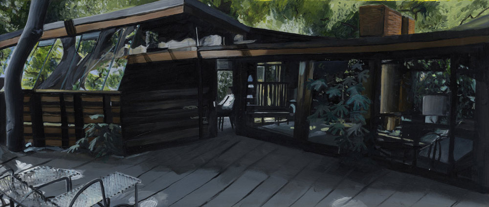
A Single Man
A number of your Palms Springs pieces were originally painted from Google street view. How challenging a source material is that to work with?
I really enjoyed working from Google street view – it was a really interesting perspective as you can kind of get a feel for an area but in a distorted, flattened way and it enabled me to get a different angle on all of the Mid-Century Modern architecture in Palm Springs. Thats the reason I started using it, I was getting really frustrated that the only images of this type of architecture that I could find to work from were all ‘architectural’ photography – always the same angles and lighting.

Google Street View composite image
This summer, you visited a number of the places that you’d painted from street view, how was that? Will you continue to work in that manner or do you prefer to photograph a scene and work from that?
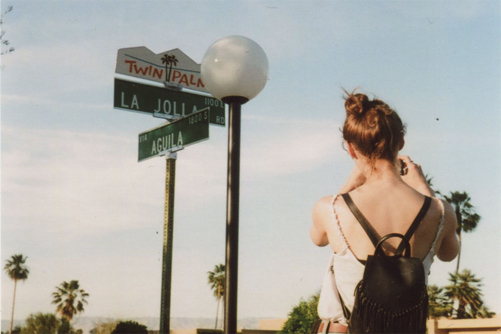
It was incredibly surreal visiting La Jolla Road (the main area that I’d painted from street view, in painstaking detail). I recognised every rock and roof and every manicured cactus garden as if I’d been there before. I’m not sure I’ll do another project in the same way as it was quite specific to what I was trying to explore in that project but its definitely an interesting way to work.
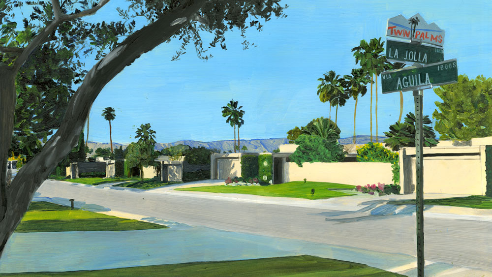
La Jolla Road
Architecture seems to be a major source of inspiration in your personal work, when did your interest in it develop?
My interest in architecture really started in my third year of my degree at Camberwell. I was trying to piece together subjects I was interested in to find a subject matter to write my dissertation on and make a personal project about. I was always interested in mid-century design and it was when I was researching that era and also looking at a lot of film references that I started to become interested in the architecture specifically.
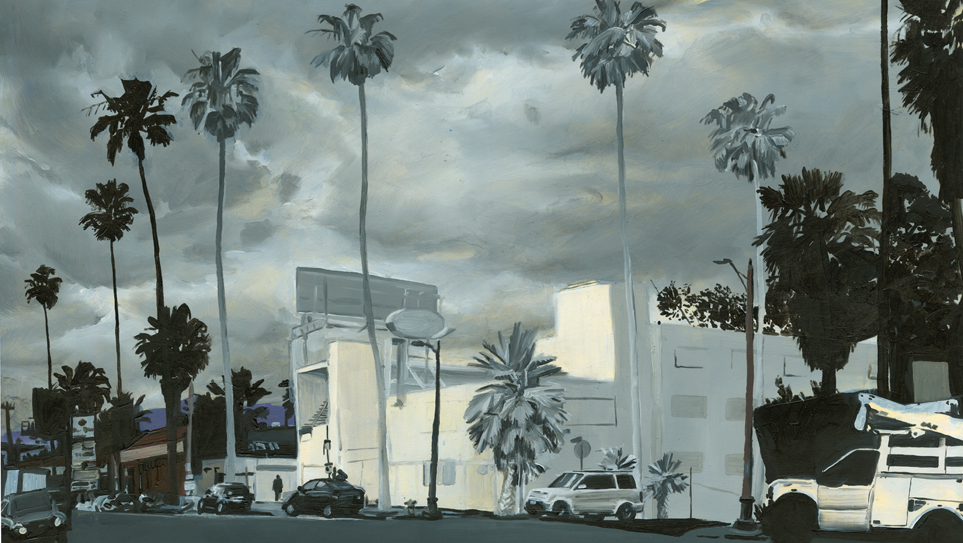
Bates Motel
What would be your one piece of advice to illustration students currently studying?
Don’t worry about finding a ‘style’ or trying to make work that looks like the editorial or advertising illustration you see. I didn’t even touch paint until my third and final year of my degree. There’ll be a project at some point where everything will just click and you’ll start to understand how it is that you work. People will love your work because it’s different rather than because it looks like that advert they saw on a bus stop or in a magazine.
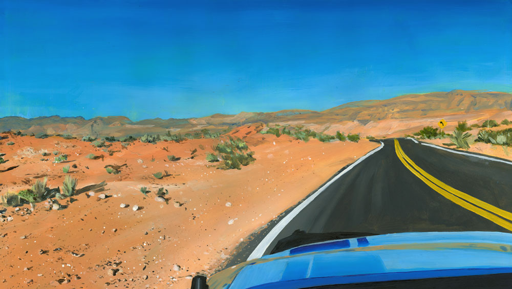
Nevada Drive
Are you working on anything at the moment that you can tell us about?
Most recently I’ve been finishing a series of paintings based on the trip I took around the USA earlier this year. They’ll be exhibited at Magma in Covent Garden later this year so keep an eye out for them!
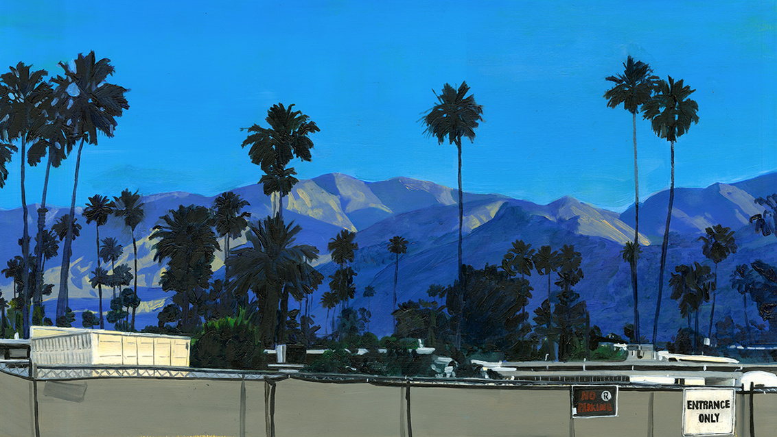
Palm Springs
_______
To check out more of Alice’s work and commission her to make your project even better, head over to her site via the link below.


