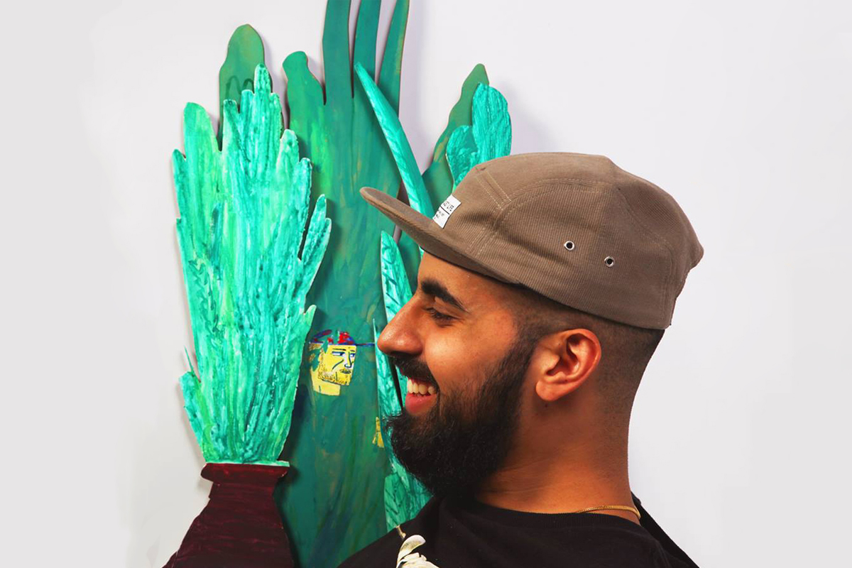
Meet the team: Raj Dhunna
We talk to the Issue Three illustrator about work ethic and inspiration
Raj’s submission to Issue Three stood out early on. Our first editorial meeting saw every member of the team put his name forward for inclusion. His work is expressive, engaging and consistently compliments its surroundings. It’s often a challenge to find illustrators whose interpretation of briefs hits the mark so consistently, so we knew we had a keeper on our hands. We commissioned Raj to illustrate our short story in Issue Three, Jamie Gillingham’s Notes on Goodbye and as expected, he perfectly captured the feeling of the piece.
For the latest instalment of Meet the Team, I caught up with Raj to find out a little more about his practice, ethos and outlook.
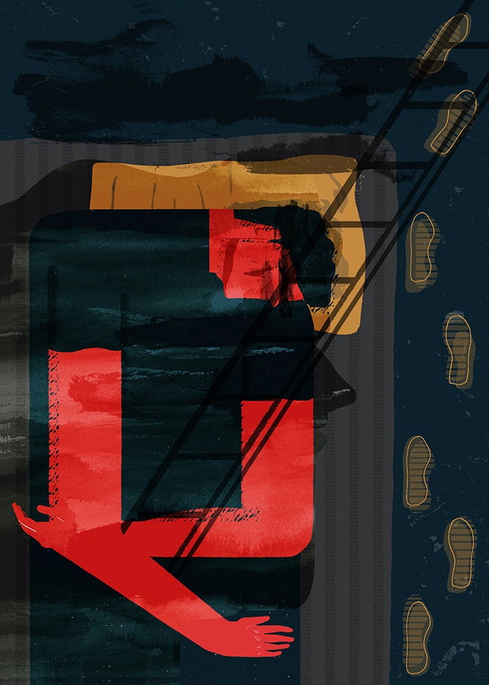
For Intern Issue Three
When did you first become interested in illustration?
Drawing was an exercise that demanded all of my focus, so I sort of became an illustrator when I was charging kids £2 for a diary cover illustration in school. Mark making was a challenge but after experimenting with various textures, tones and lines with a pencil, a new language began to emerge that resonated with me more than maths or science. It all related back to the density of the mark that was made.

You studied Visual Communication, specialising in illustration. How do you think the first part of the course influenced the way you work?
It didn’t, to be quite frank. The beginning of the degree course echoed my foundation course as we explored other disciplines. I just experimented with the things I avoided since foundation. A big part of the course was collaborative and I guess that had a bigger effect. There was a mix of people with a contrasting work ethics and it made me realise that even though we’re on the same level academically, the work rate and mentality stems from the personal outlook and practice. This instilled confidence in me from the beginning because I was always quite driven when wanting to make work.
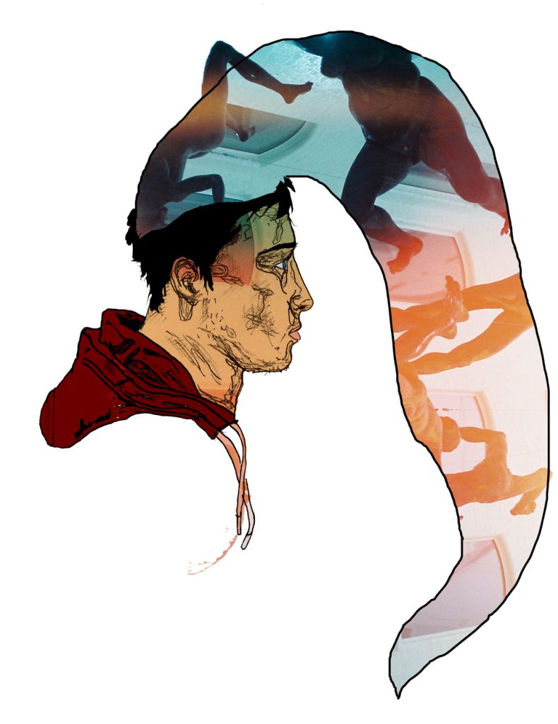
What can you tell us about your residency at Birmingham Institute of Art & Design? Is it nice to be back on your old stomping ground?
I was doing a printmaking residency there in early 2015 and I produced work that I was proud of. The only problem was that balancing work (which was a part time job), commissions and the travel back and forth from London to Birmingham every week was tough and frustrating. I never gave myself the head space needed in order for me to create. Getting back into a mode of creating work that banished me from the digital way of working was very refreshing, and sparked me off to start creating a body of work that was focused on me becoming more of an image maker opposed to this ‘digital’ illustrator that I’ve become.
What’s the journey been like since graduation?
I graduated in 2014 and it’s been a natural route I feel to where I am now. It took me a while, but the back end of 2014 to mid of 2015 was a real growth period. I’ve concentrated on freelancing and formed a checklist that I’m actually keeping to and crossing things off sooner than I thought. Keeping goals and aspirations motivates me, so I’m always setting myself new goals, every two months, to make sure the word stagnant is never an adjective to describe myself.
I’ve picked up clients and built some lovely relations with art directors, small businesses and other illustrators. I’ve also lost out on some brilliant commissions, and realised my e-mail voice gets a bad reception at times.
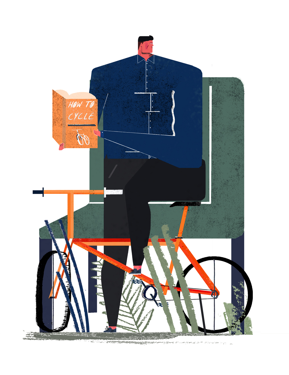
One of the first editorial illustrations I did coming out of uni was for The Ride Journal, and it’s still one of my favourite images I’ve produced because it conveyed everything I wanted it to, and appeared how I wanted it to. As my work has progressed I’m finding it harder to get my work exactly how I’d want it to appear…and I’m not sure why that is.
Does your illustration influence your design work or vice versa?
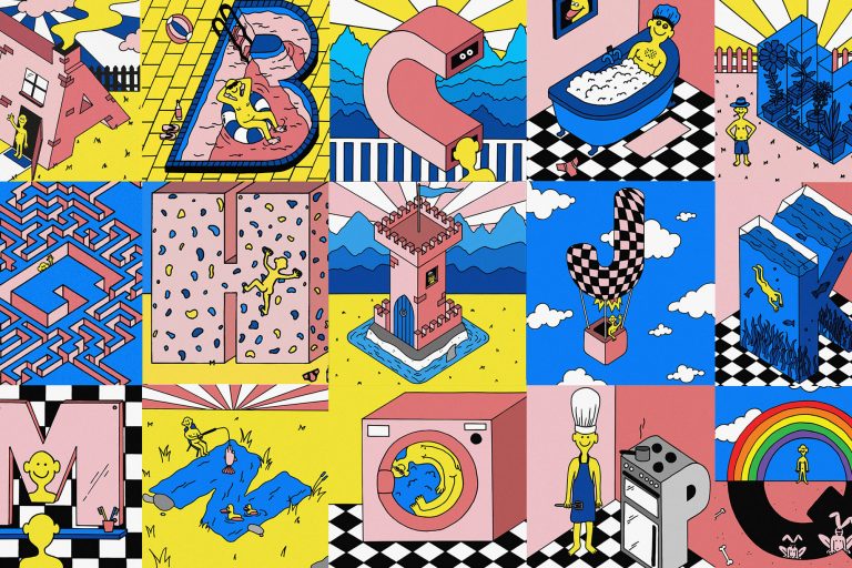
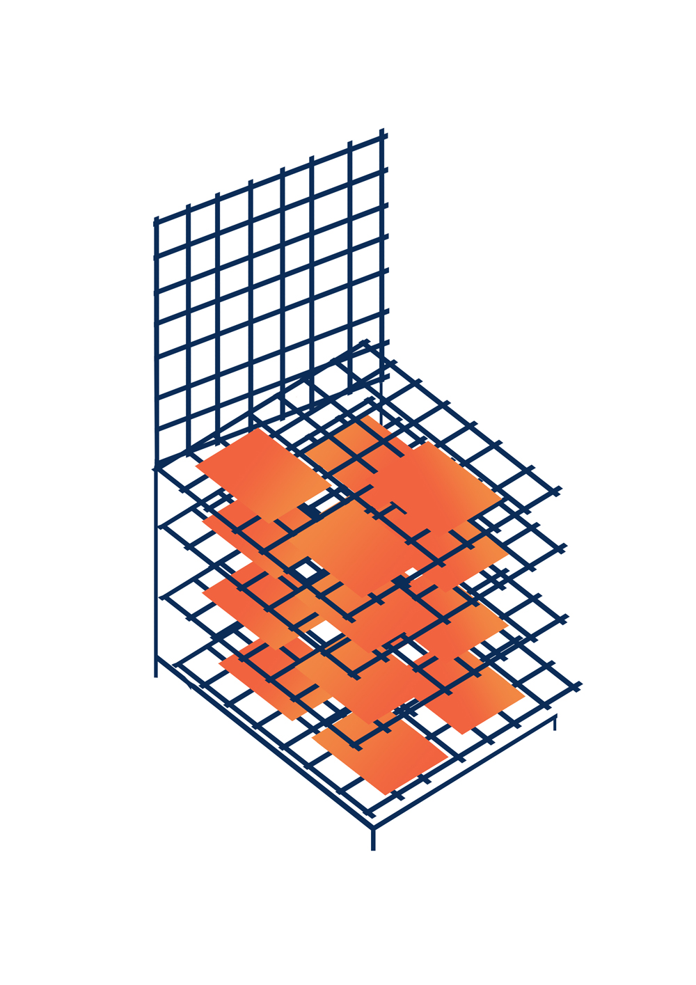
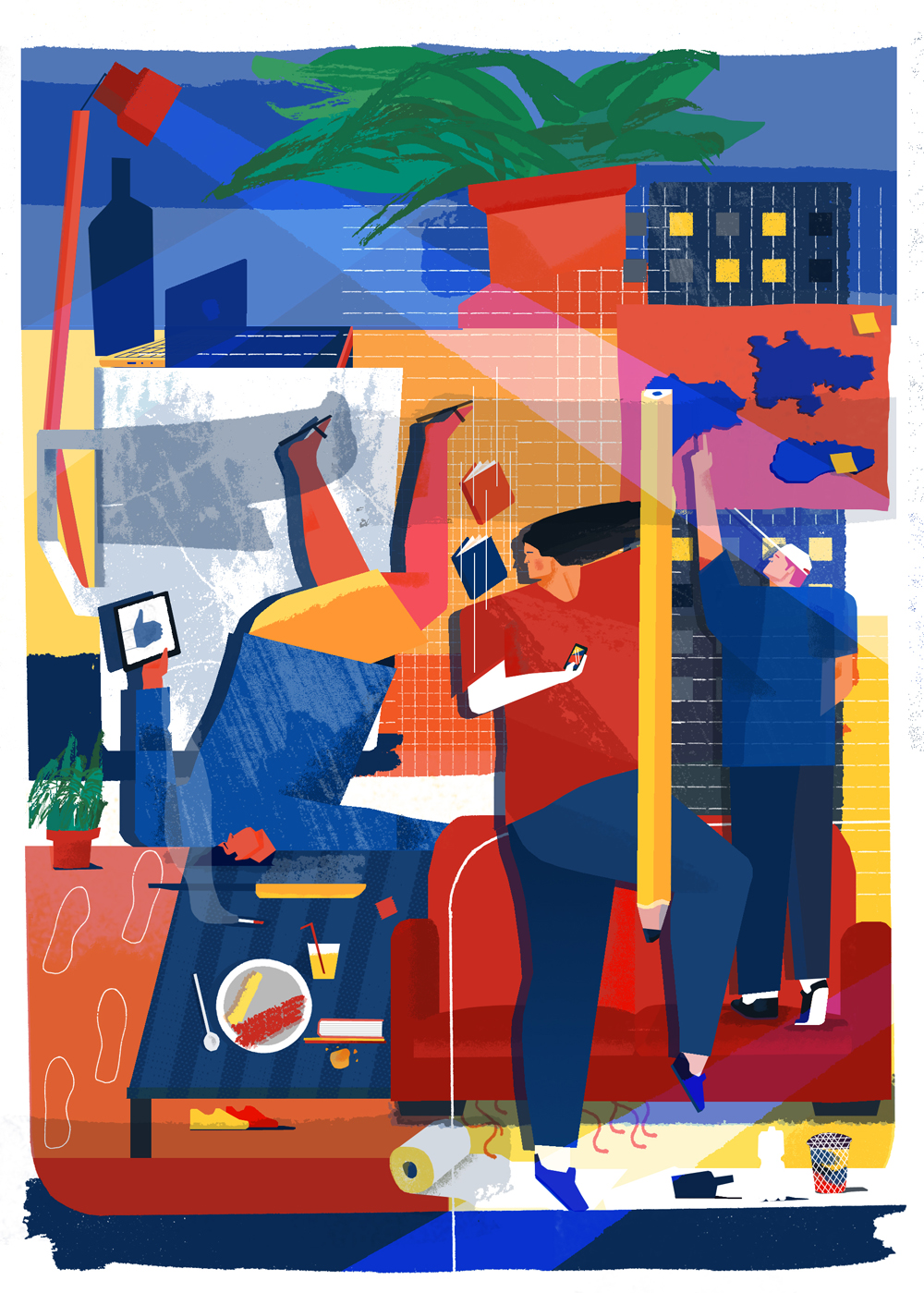
My design work is my illustration work in a sense. I’m aware that they’re different practices but I immediately think of the same references when contemplating a design or illustration brief. ‘Big framed shapes’ (below) is a good example of how I integrated a design approach with a very stylised illustrative outlook on the project to merge the two together.

When you first contacted us, you talked about refining your style in order to compete with the best out there. How important is that as an ongoing process in the freelance world?
Ha, not much has changed to be honest. I’m a competitive person and I’ve managed to instil that into my practice by endeavouring to be aware of who and what else is out there in terms of illustration and design.
A lot of your illustration work is editorial and you’ve worked for some major publications. What about editorial work do you feel suits your style and process?
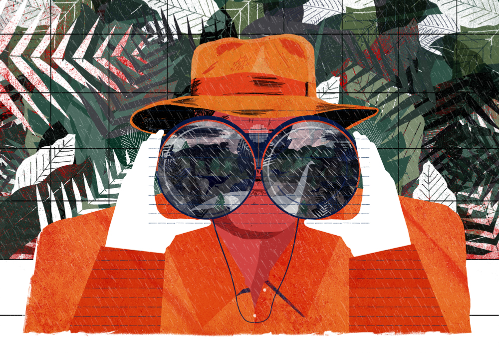
I was re-introduced to editorial by my third year tutor, he showed me illustrators who had a language that resonated with me when working in editorial. It shocked and intrigued me to see how some beautiful artworks could be used for one little section, and then never seen again but for their websites or short runs of prints. I followed that up by exploring the relationships between image and text, consumerism and artwork and how editorial illustration has become an example of contemporary illustration being integrated into society.
It’s easy for me to obsess over an illustration and dwell on what makes the ‘perfect’ image. When I completed my first editorial brief, and saw it sit next to the text…it felt right. As if the hours stressing about composition, marks and colour didn’t even happen. The process and the end product are what initially drew me to editorial but now I see it as a challenge to do the text justice, and make sure the person looking at the article also sees my illustration as an important element of the information they’re digesting.
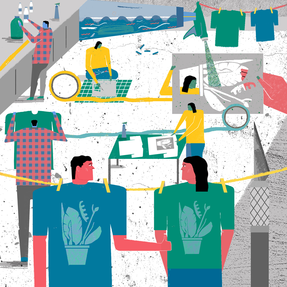
What is your creative process?
First and foremost I’d read the brief meticulously three or four times and then go for a ride or run to clear my mind of any clutter or other illustrative references I may have stored. After that, I begin to think about how my image can do the text justice.
The human figure is something I tend to gravitate towards and want to incorporate into my work, or at least a recognisable part of the form.
I have a few small sketchbooks in my studio, so I make sure there’s always at least one on me at all times. I begin writing words down, creating mind maps, do some reportage sketches and explore forms and compositions through some pretty bad thumbnails. The idea is on top in terms of hierarchy, then the execution comes after that.
It’s about trial and error for me, and I’ve realised that I only want to get up and produce work if I’m in a good mood that particular day (when creating personal work), forcing myself never leads to anything good, but I keep everything none the less as a reminder. If something out of the work appeals to me, like the composition or the marks, then I’ll often re-use an aspect of it again in a new piece of work.
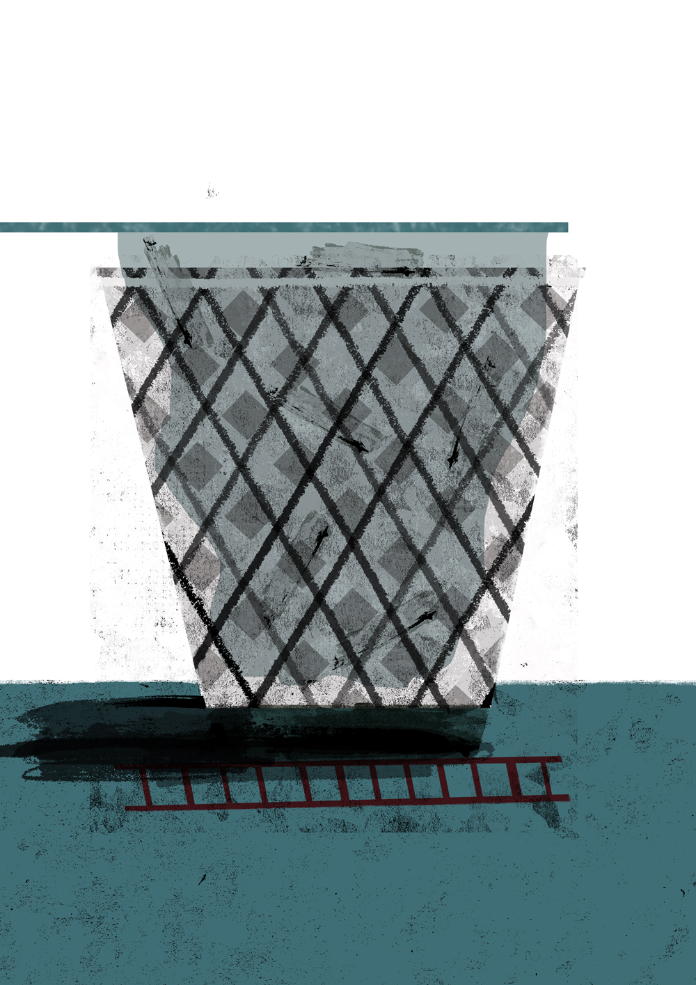
What would be your advice for illustration students looking to work freelance?
People want your service, you just have to be patient when looking for the appropriate place for it to be seen. Becoming complacent after graduating was my biggest fear, so I worked myself pretty hard. Depending on your aspirations and goals, plan accordingly and ask yourself ‘what do I want to have completed year after graduating?’
Also, remember. Hashtags only get you so far, so I think direct contact (mail, letters, calls or meetups) with the people who can get you in the right places are essential.
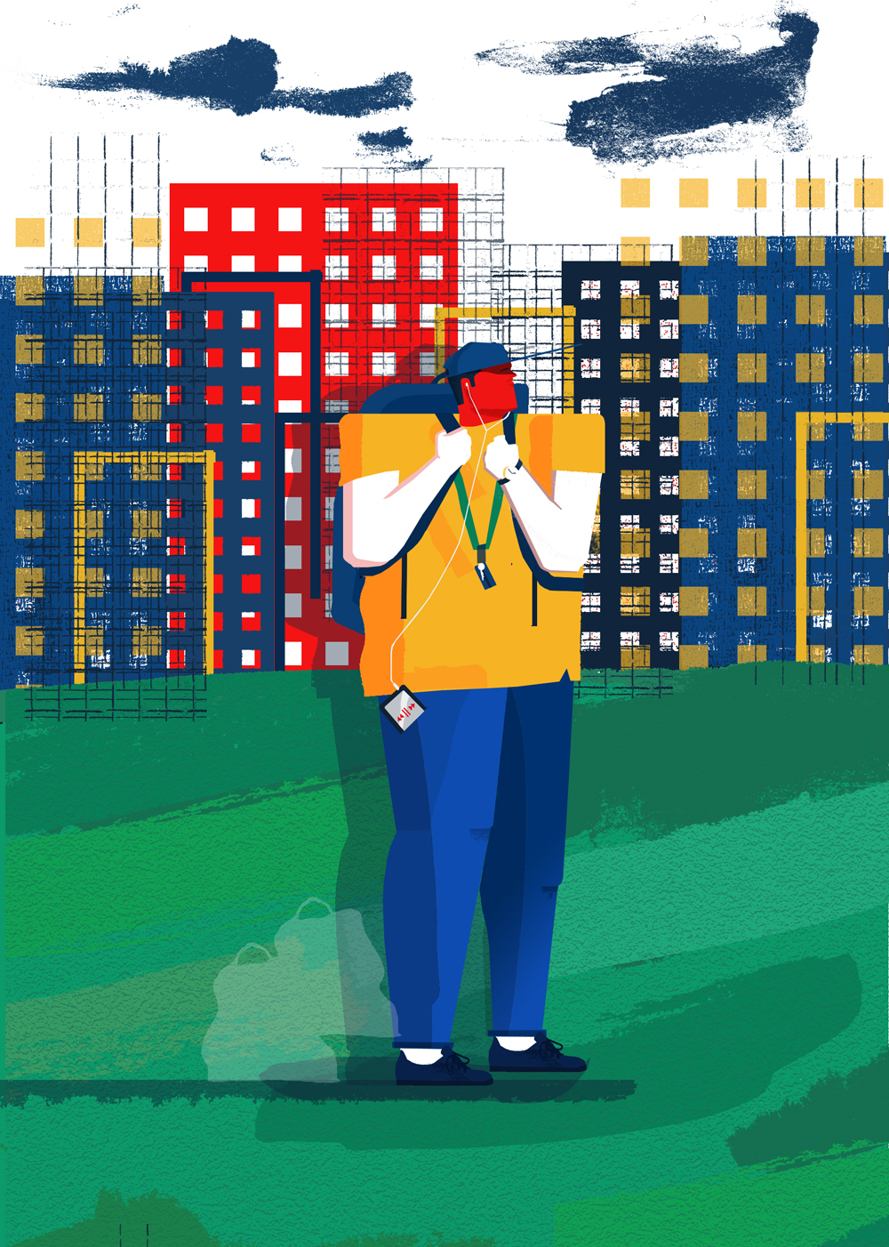
What are you working on at the moment that you can tell us about?
Recently I finished off a cover image and five illustrations for The Skinny student handbook, which is distributed in North West England and Scotland. It was a fun project to get stuck in to and by illustrating in a bold and bright style reflected back to my time at university and how much I enjoyed it. And as for now, I’m working on a personal project that will hopefully be seen at the end of the year or beginning of next year!
_______
For more from Raj, head over to his website via the link below.


